When I was a journalism student, my professor gave us a specific formula to follow in order to help us practice the art of writing a solid article. As we got better at following this formula, it became more open to interpretation, but understanding the main principles of writing a good article was key.
Similar to the formula of a good article, the principles of design are the building blocks that make a successful app. Now that we’re in a time with a lot of digital clutter, there’s a lot of people and businesses trying to be heard. The thing that makes them stand out is their design. A company’s brand, typography, colors, logos, and language all need to grab the eyeballs of their audience.
At Shopify, we’ve implemented design principles into everything we build. We design our product so merchants with no experience can comfortably use it, and those with expert-level experience can also have a little fun making their store.
The same design principles should also guide the apps developers make for merchants to use. Not only because it’s what’s best for merchants, but also because it’s what’s best for developers to connect with their users and a lot of times, their funders and investors.
Apps with easy and appealing designs, likeOberloandMega Menu, are more likely to get noticed. But what makes a good app design?

Good design strives for simplicity, aesthetics, and cohesiveness throughout the app. If you want your app to be successful in theShopify App Store, take note of the following design guidelines and start creating great apps!
Polaris — Shopify’s north star to design principles
Our design system Polaris is full of resources, including a component library and style guide, designed to help you build stellar applications that look and feel like they were designed by the same team.
Check out PolarisHomogeneity, clarity, and simplicity

The focus here is to make sure whichever problem your app is solving, it’s giving a simple solution. There are many other apps vying for a merchant’s attention in this TL;DR (too long; didn’t read) world. Creating a consistent product that has more of a personality than just a bunch of graphics and documents is most memorable to a user. The best apps feel more like your friend than an application. This is done in a number of ways:
- Elements that behave the same should look the same, and elements that are opposite of others should look the part, like the delete button and the save icon.
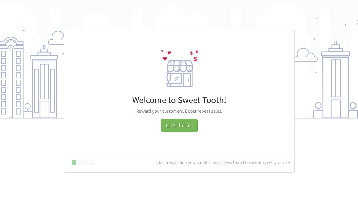
- Use common color codes, for example green for success, red for urgent, etc. Just like inSweet Tooth’sstart button above!
- Have progressive disclosure: show only enough info so merchants can make an informed decision. Don’t show all the info at once; progressively disclose information. See howLocksmithdoes it by getting you to create one lock first, before showing you the app’s different settings, or how it can interact with your customers.
- Make actions quick to achieve.

Remember, an app that is easy to navigate and is well laid out is less overwhelming and will always be preferred over one that is disorganized and overloaded with information.
Hierarchy
A person’s eyes take just2.6 secondsto focus on a specific part of a webpage or application. Once they’re focused, the person will have an opinion based on what they’ve seen, and it impacts the way they use your app. Letting the important information take dominance over other things provides a natural next step for merchants and leads them through each element in order of importance.
You can get dominance by contrasting size, colors, and shapes. But remember, when everything is bold, nothing is bold, so be mindful when designing hierarchical elements. Incorporating hierarchy into your design works harmoniously with the other elements of design. It organizes information so that it’s simple and easy to read. Hierarchy gives your design a focal point, which lets you grab the user’s attention.
You might also like:The Essential List of Resources for Shopify App Development.
Aesthetics
Having a good looking app is crucial, but that doesn’t always mean following the latest design trends. Brand differentiation is more important than keeping up with the latest trends, but don’t go back to the time of wagons when everyone else is driving fully-loaded cars.
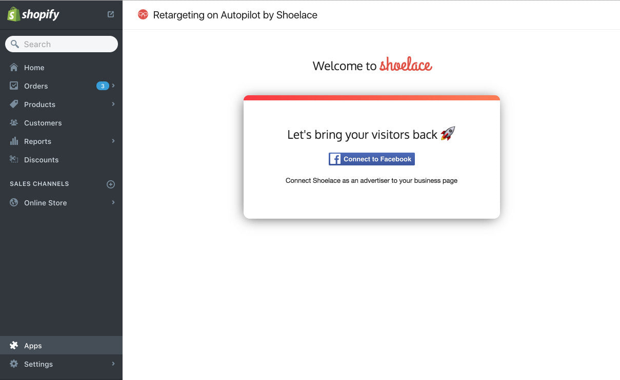
You don’t have to strap yourself to IKEA’s view of minimalism, but you have to make sure things don’t look dated like Windows 98. Finding that balance of approachable and clean mixed with your company's personality can be a daunting task, but is worth it in the end. TakeRetargeting on Autopilot by ShoelaceandAko Retargeting为例。这两个应用程序显然是重新定位目标应用程序s, but both have a very different aesthetic, which is still appealing to look at.


Shoelace is going for a more fun, friendly aesthetic, while Ako is incorporating a funky modern aesthetic with it’s sharp font interesting colors. A common denominator with the two apps is their professional looking and clean interface, while both having very different aesthetics.
Good aesthetics can have a lot of different styles. A few you’ve probably heard of are:
- Minimalist: uses low-key and cut down design elements.
- Vintage: incorporating retro elements into your design.
- Modern: using trending design elements.
- Classic: a timeless design that looks good everywhere.
Whichever aesthetic you go with, always make sure you incorporate the other design elements, otherwise something intended to look vintage could just look overwhelming.
You might also like:How to Get Your App Featured on the Shopify App Store.
Prioritize a well-designed app
When you’re ready to submit your app to be published, its primary goal should be to put the merchant first. There aredifferent types of merchants所以有同情心,找出营销上ant pain points should be your biggest driver. A well-designed app, regardless of the solution your app is trying to solve, is critical to an app’s success as it’ll increase retention. If people like using your app, that’ll increase the retention rate of your customers. Remember, visual presentation is key, so stuff like font, colors, logos, and layout should all be:
- Aesthetically pleasing
- Consistency with the app’s admin and the brand
- Easy to use
Design can be subjective, but merchants can always tell the difference between a well-designed app and one that’s poorly designed.
Want to learn more about building apps for Shopify?Check out our comprehensive list of articles onShopify App Developmentand theShopify API.
