Operating an online store has its pros and cons. Sure, you can reach a wider range of customers and work from the comfort of your computer.
But unlike your brick-and-mortar counterparts, you can’t physically observe your customers as they navigate your store and decide whether or not to buy.
However, both physical and digital retailers struggle with the same question:How can I get more visitors to convert?
We compiled this guide to help ecommerce website owners learn how to optimize their product pages and make them more actionable. This post will present a combination of qualitative and quantitative methods to help you better understand your users’ behavior on your product pages.
Table of contents
- How to discover why people aren’t clicking Add to Cart on your ecommerce product pages
- Observe how your visitors interact with your product pages
- How to make your ecommerce product pages more actionable
- Write descriptive product copy—but include only what’s necessary
- Use social proof as authority signals
- Make it nearly impossible not to take action
- Apply brick-and-mortar retail design principles
- Check what’s leading your shoppers to product pages
- Create supplemental content
How to discover why people aren’t clicking Add to Cart
Your Add to Cart button isn’t responsible for its own success. Even the best-tested, most optimized CTA can’t compensate with poor design or misleading product copy.
So, what can? Well, your customers can tell you. In this section, I’ll discuss how to understand your buying experience through your visitors’ eyes—through both testing and talking with your customers.
These methods can highlight various problem areas, from your product display or CTA placement to finer details like colors and wording.
Observe how your visitors interact with your product pages
The below analytics and testing methods can uncover data that helps you determine why visitors aren’t clicking Add to Cart.
1. Behavior analytics
A quick glance at Google Analytics can reveal how many people land on a product page but don’t buy anything—that’s yourbounce rate.
Other helpful behavioral analytics to track when working to improve yourecommerce CROinclude:
- Exit pages
- Time on page
- Site searches
- New vs.returning visitors
虽然这些指标可以帮助的哟ur non-converting product pages, they don’t go too far in telling you why. The rest of these methods are more helpful for this.
2. Heat mapping
Heat mapping tracks how visitors interact with your website. It’s typically split into two methods: click-tracking heat maps and eye-tracking heat maps. (The former is more popular and cost-effective, as the latter requires special equipment.)
Both methods help you understand with which site elements your audience is interacting—and which may not be getting any attention at all. Popular heat-mapping tools includeCrazy EggandHotjar.
If you’re noticing poor conversion [with Hotjar], look at your exit pages metric to confirm that users are leaving from product pages as opposed to a cart page,” says Germaine Muller, founder and Director at Futuretheory. “This might indicate an error with your checkout process.”
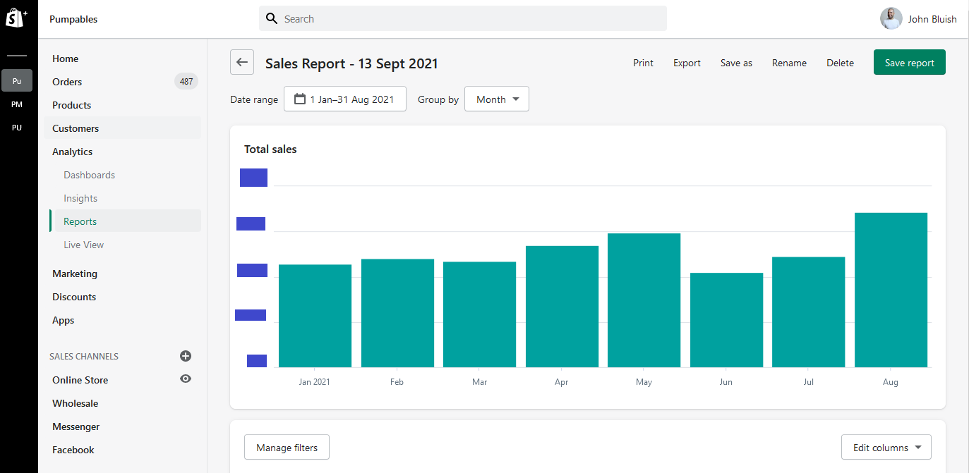
John Bluishis a Sydney-based Shopify developer tasked with improving clientPumpables’ ecommerce CRO. After tracking customer behavior using Hotjar, Bluish discovered two things:
- Long load times led to high bounce rates (39% exited the Pumpables site before it fully loaded).
- There was no consistency to how visitors browsed the site, as the homepage provided no direction.
Bluish’s Hotjar analysis helped him create a simpler, faster-loading websiteandredesign the homepage to invoke intent and direction for the audience. (I touch more on this in No. 5 in the next section.)
His outcome for Pumpables was outstanding. The site’s load time dropped by five to six seconds, and when Bluish implemented the new design at the start of July, Pumpables’ sales in August broke its 2021 record (as you can see below).
3. User session replays
User session replays enable you to watch customers interacting with your ecommerce site. You can review where a user clicks or stops to view content, which pages they don't visit, and any other actions leading up to the visitor ideally adding a product to their cart and transacting.
Some would argue that user session replays are more useful than live user testing, as the latter happens with administrators watching, which may cause shoppers to act differently or more reserved. On the other hand, user session replays are captured during shoppers’ natural visits to your site.
One helpful and free tool to monitor user sessions isMicrosoft Clarity.
Jessica Postiglione, CEO atBonny, credits Microsoft Clarity and its user session replays for her most impactful site updates.
These [user] sessions have been incredibly useful to help us redesign product pages to improve conversions,” she says.
“For example, we noticed that customers wanted to magnify images to read the supplement facts panel. Through user session replays, we noticed a pattern that customers kept clicking on images in an attempt to enlarge them.”
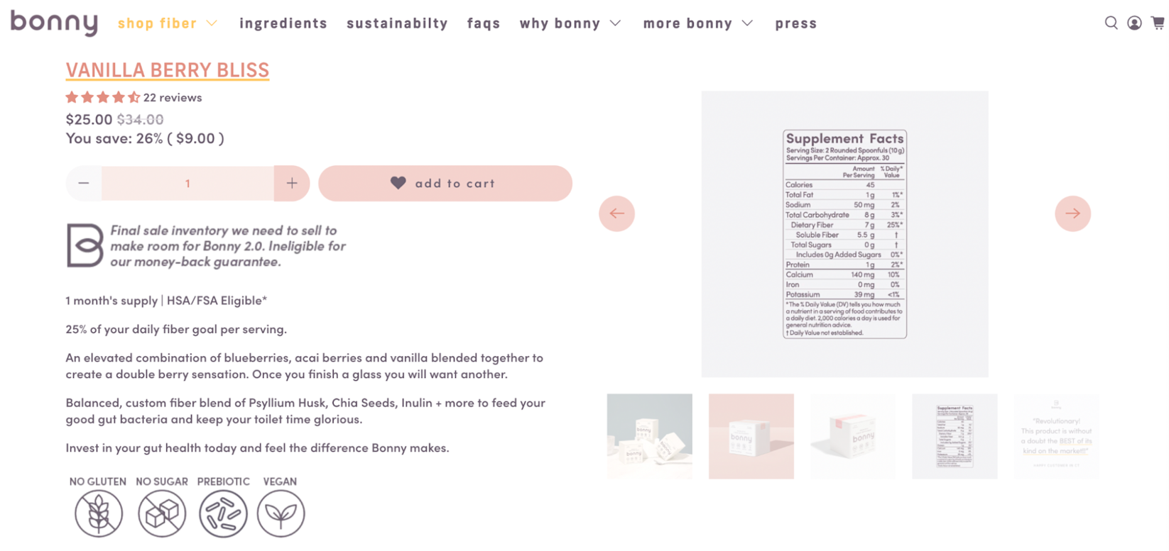
With user session replays, you can experience your product pages from your customers’ point of view and hopefully identify what’s causing them to leave before buying.
4. A/B testing
I couldn’t wrap up a section on ecommerce experimentation without a mention of this CRO staple:A/B testing—the most straightforward way to test your product pages.
Note that A/B testing can only truly help youafteryou’ve secured:
- Time.A/B testing is by far the longest experimentation method in this article.
- Ample audience size.To get results you can count on, A/B testing needs to happen with an audience of at least 1,000 visitors.
- Test components.Only when you know what design, copy, or product elements may be affecting your ecommerce CRO can you test variations of them.
To execute an A/B test for your product pages, create two separate pages with only one varying feature (e.g., body copy, ATC button color, etc.). Send 50% of your traffic to variation A and 50% to variation B, and use Google Analytics to analyze which variation is more effective.
“你也可以把你的(A / B测试)和热量maps to discover where and how visitors navigate each of your product page variations,” says Brandon Schroth, co-founder ofNomad SEO.
5. Learn from the professionals
To get an ecommerce conversion rate that rivals that of big name brands, why not observe how they’ve structured their product pages and customer journey?
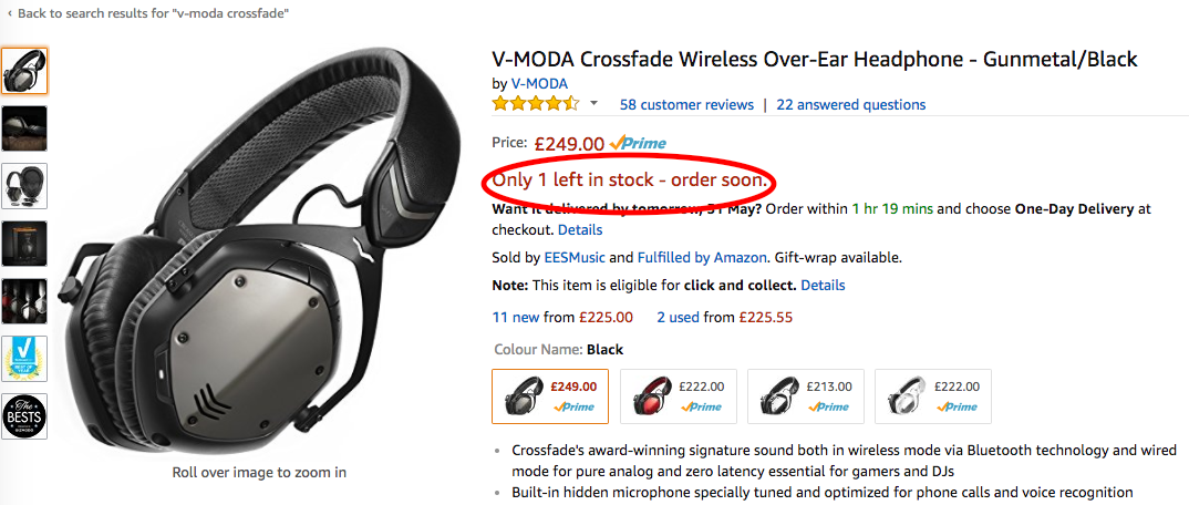
Take a look at some of the biggest ecommerce stores to see what lessons you can learn. Amazon’s scarcity signals (“Only 3 left!” or “Free delivery tomorrow if you order in the next 4 hours”) are first class.
Nike does a great job of prompting visitors to convert—its product pages feature great photos, user-friendly interfaces, and unique features like “Save for later” and “Buy now, pay later.” All of the product copy works to strip away any buyer objections.
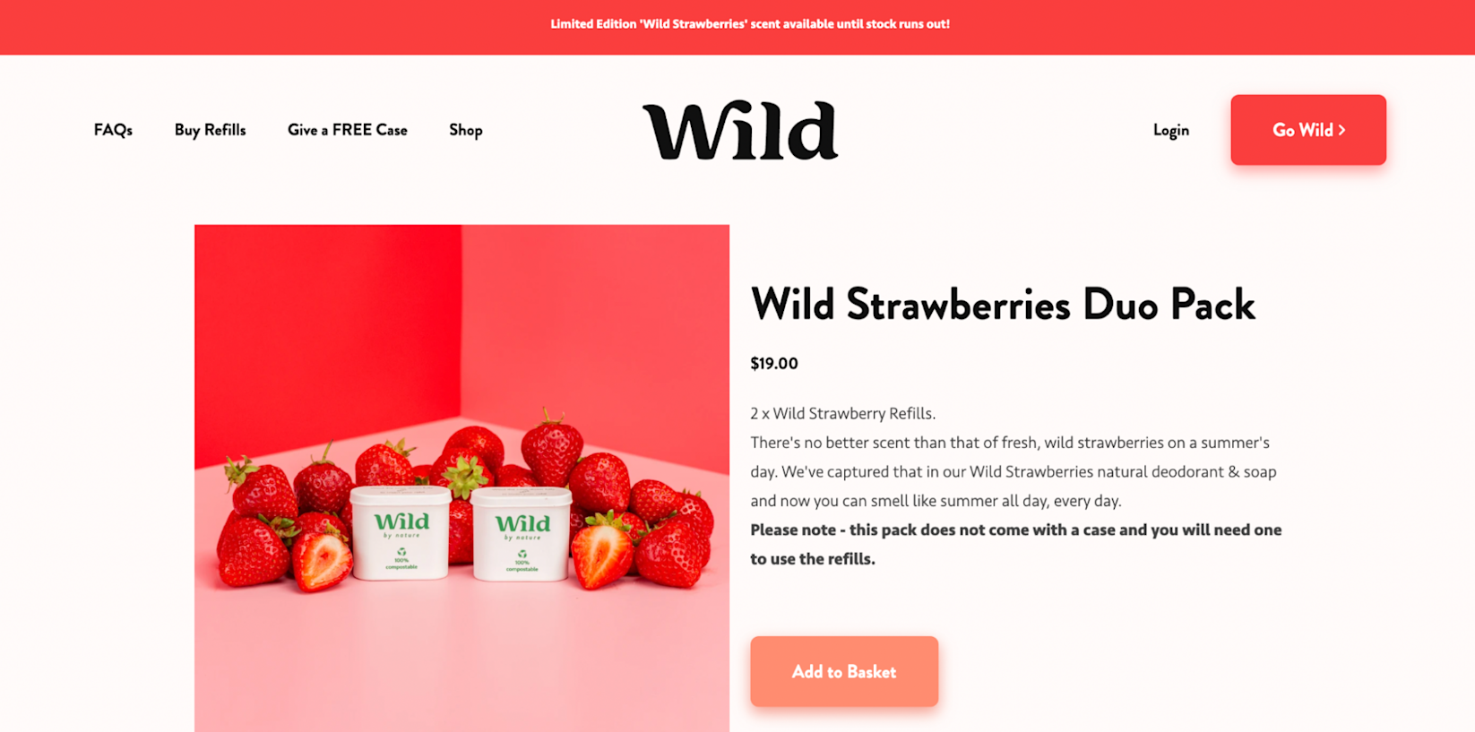
Wild, a refillable deodorant startup, has a nicely designed website that leads to a no-nonsense checkout page. It also features an express checkout—a good option for customers who prefer a quicker experience.
Collaborate with consumers to better understand their behavior
User testing provides a more direct way of understanding why your customers aren’t taking more action on your product pages. It allows you to ask a set of users to complete tasks or answer questions.
6. Surveys
Use exit surveys to ask exiting customers how you could improve your site. Many online retailers opt for pop-up forms that ask, “What could we have done better?” or “How could we change your mind?”
Some argue that exit surveys don’t garner enough responses to be worthwhile, but in reality, the responses you do get will be those of qualified customers—even if they are few and far between. If you do want to up your response rate, consider providing a multiple-choice question instead of an open-ended one.
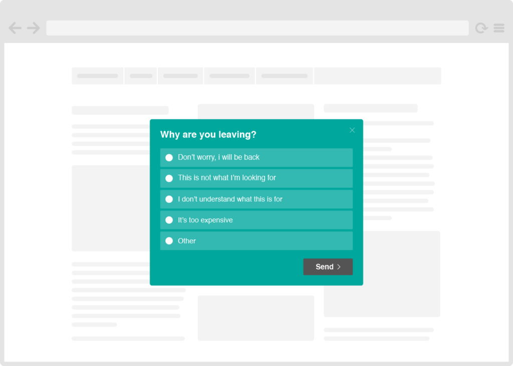
Either way, people who take the time to answer your survey are those who would’ve completed their purchase had they found what they needed. These responses can help you make the necessary changes to increase conversion rates and sales.
7. Live chat
Live chat is another way to directly engage your customers, ideallybeforethey exit without making a purchase. Consider setting up a live chat prompt that says, “How can we help you?” or “We’re here if you need us!”
One thing to know about live chat: customers tend to interact with those when they’re having issues with their orders rather than being unconvinced or uncertain about a purchase. It’s a great asset to have on your side and can help with conversion rate optimization, but it may not be as impactful as direct interviews.
8. Interviews
Instead (or in addition to) having the live chat option on your site, cut right to the chase. Gather 10 to 20 customers and ask them about their experience shopping on your website.
Or reverse the process. Find 10 to 20 consumers who’ve never shopped your ecommerce store and ask them to do so for the first time. Provide a discount or freebie in exchange for answering a few questions about their experience. See if they can answer:
- What kind of products do we sell?
- Can you find a product that you’d like to buy?
- From the product page alone, can you tell me what it looks like, what the specifications are, and what variations (i.e., sizes, colors, etc.) are available?
- Can you add the product to your shopping cart and then change the sizefromthe cart?
- Can you continue shopping and add another product to your cart?
- What are our shipping options? Delivery time(s)? Return policy?
Both interview approaches should glean helpful information about what’s working and what’s not working with your shopping experience.
Learn more:The Best Tools to Help You Improve Your Ecommerce Conversion Rates
How to make your ecommerce product pages more actionable
There aredozensof reasons why people aren’t adding your products to their carts. Perhaps the page isn’t telling them what they need to hear. Maybe it’s confusing and not user friendly.
They simply might not be interested in that product. Heck, they might be about to click but get distracted (which is where yourabandoned cart emailscome in).
Whatever the reason, here are six ways to make your ecommerce product pages more actionable and likely to convert.
1. Write descriptive product copy—but include only what’s necessary
Each product page should include highly descriptive copy that’s written with the customer in mind. Describe the product components and features, and include all variations: different sizes, colors, bundles, and more.
While product features are important (especially for highly technical or complex products), don’t let this section outweigh the productbenefits. Explain how your product improves the customer’s life. Do so by tapping into the customer’s emotions, making them feel like this product is a necessity for them and will help them meet their goals, whether financial, physical, social, or the like.
Remember thatecommerce copywritingis frequently a psychological game. Offer your customer free shipping, even if it requires you to raise product costs.Seventy-five percent of consumerssay that the option for free shipping greatly impacts their ordering decisions. If you do offer free shipping, ensure it’s clearly stated on each product page.
Creating a sense of urgency is also among the hottest-selling strategies. While fake urgency is unethical, it's acceptable to display real cases of low stock or limited availability to drive more customers toclick Add to Cart.
Remove unnecessary prompts and content from the product page. It’s tempting to include long-winded copy that rivals a sales page, but customers will likely scan through that or find themselves overwhelmed. Only include relevant product details and link out to use cases or complementary content on your blog or knowledge base. (We talk more about this in No. 6.)
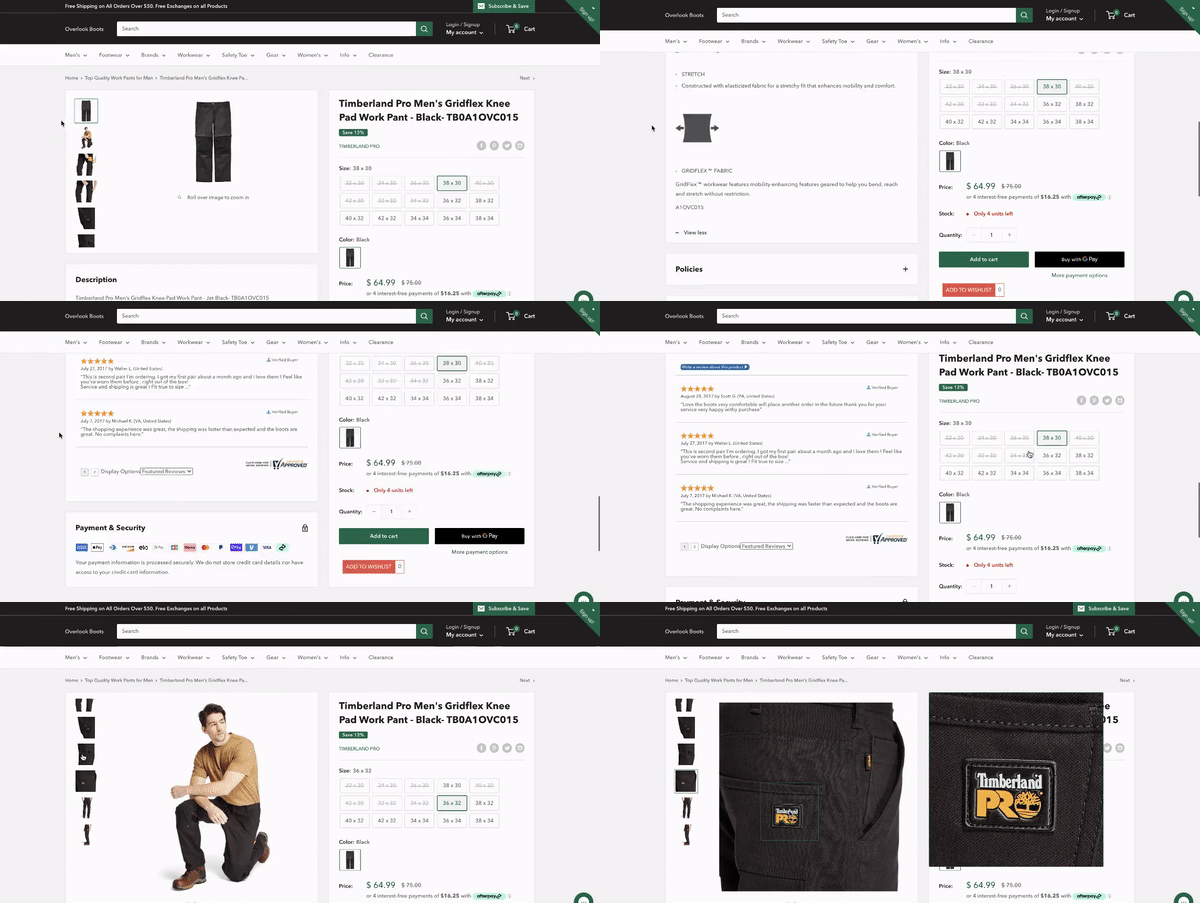
We’ll also dive more into product page design in No. 5, but for pages with a lot of information, consider how you can simplify the reading experience.Outdoor Bootsoffers expandable text boxes so shoppers can read through pertinent information without having to scroll far. You’ll also see it has included all available product sizes as well as payment and shipping options.
Lastly, well-written product copy does more than convert customers—it also attracts them throughSEO. You can increase your product page’s performance by improving the SEO of your page. Optimizing your product page can help you draw in the appropriate audience who are searching for a product like yours. Be sure to optimize all parts of your product page from the metatags to the product descriptions.
2. Use social proof as authority signals
“Implementing social proof on your site can be one of the most effective methods for increasing your overall conversion rate,” saysJon MacDonald, founder of The Good.
By creatively and soundly displaying social proof [like images and reviews], ecommerce merchants can get more sales. After all, claims by the seller or manufacturer are suspect. When other consumers are raving about your company, though, shoppers are more inclined to accept social proof as fact.”
作为一个网上购物,我同意。我最喜欢的一个parts of shopping on Amazon (besides the two-day shipping) is the customer photos. Until I see a product “live,” can I trust what it’ll be like once I purchase it?
Social proof is especially powerful for ecommerce since shoppers can’t physically inspect the products they want to buy. Images and reviews from previous customers can help mitigate any hesitation that comes from buying online. For example:

I’m not sure what kind of reviews the chair had, but I’d imagine real customer feedback would’ve helped the shopper avoid this outcome.
Your product page should aim to build trust with your audience. If they feel as though the information is wrong or misleading, they’ll likely bounce off. Reviews, testimonials, and customer images (user-generated content) not only improve your sales but also strengthen your online reputation.
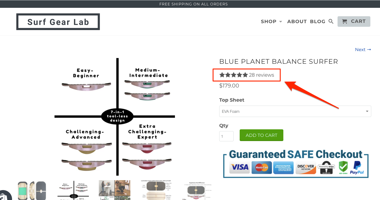
Marc Bromhall is the founder of Shopify storeSurf Gear Lab. He recently made two key changes to his product pages that saw a 17% uplift in checkouts.
“First, I added a “Safe Checkout” seal. This helped provide legitimacy to my store, or least created the right perception of my store, as it has always been legit,” he says. “Secondly, I moved the reviews score and counter further up the page to now sit directly under the product titles. Before, it was below the fold, and clearly this was not effective enough.”
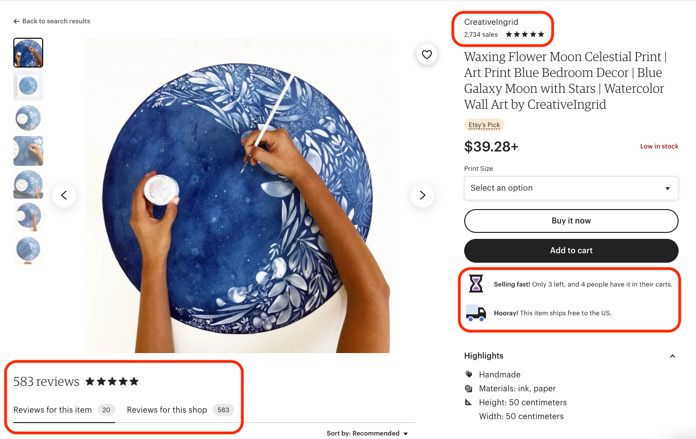
Another ecommerce platform that’s designed tobuild trust with its shoppers is Etsy.
“To make product pages more actionable, it helps to have trust-building elements like customer reviews and star ratings, a clear return policy, and a secure website,” says Brandon Schroth. “Even though each [Etsy] seller is independent, the product pages show the number of items sold, customer reviews, the shipping/return policy, and allows people that have purchased the items to upload their photos.”
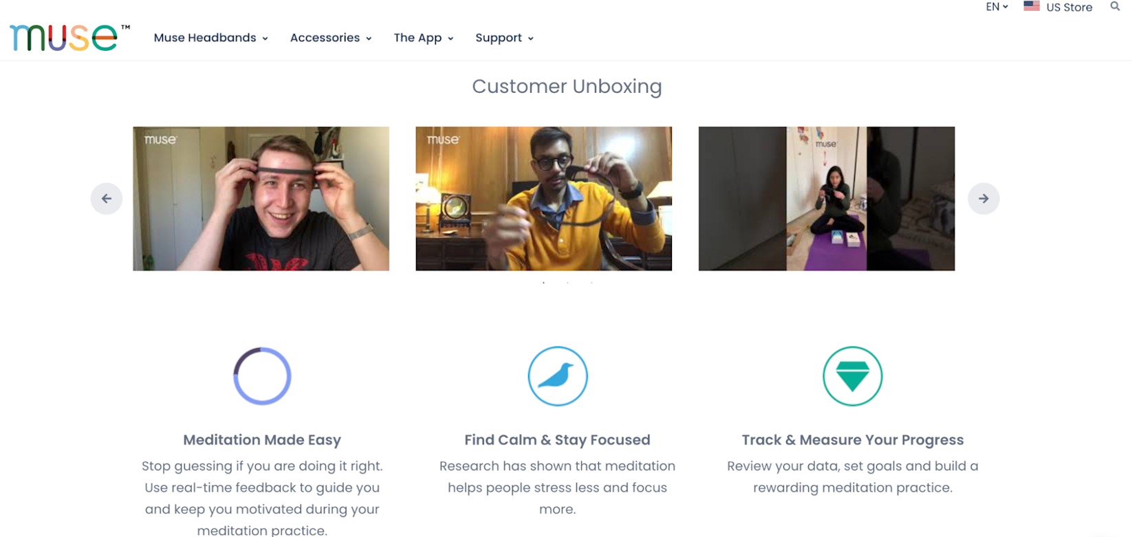
Lastly, adding video to your ecommerce product pages is yet another way to build trust and showcase your products.
“Your goal is to help your customers make an informed decision, and videos are a fun and simple way to enhance a customer’s shopping experience,” says David Strauss, Ecommerce Manager atWatchMojo. “High-quality content builds trust with the customer. Your customer likely knows basic information (price, dimensions, ratings, and reviews), so tell them something they don’t already know. How does [the product] feel in your hands? Does the material feel durable? Is it heavy? Try to anticipate what kinds of questions your customers might have about your product and create videos to answer them.”
真实性是最终建筑tr的关键ust with the customer. Leveraging reviews and unboxing videos from already satisfied customers is an extremely cost-effective way of sourcing video content with authenticity baked right in. See how Muse does this:
3. Make it nearly impossible not to take action
Don’t assume that your shoppers will scroll or click through to take action (a.k.a. make a purchase). Whether it’s a pop-up box, button, or form, make sure that assoonas a visitor lands on a product page, they can purchase with little to no difficulty.
“Ensure that your [ATC] buttons stand out rather than getting lost in your page content,” says Germaine Muller.
Have clear buttons above the fold or close to above the fold where possible so that users who are already primed to purchase can do so quickly rather than searching for the buttons further down.”
An excellent example of this is Shopify storeWype:
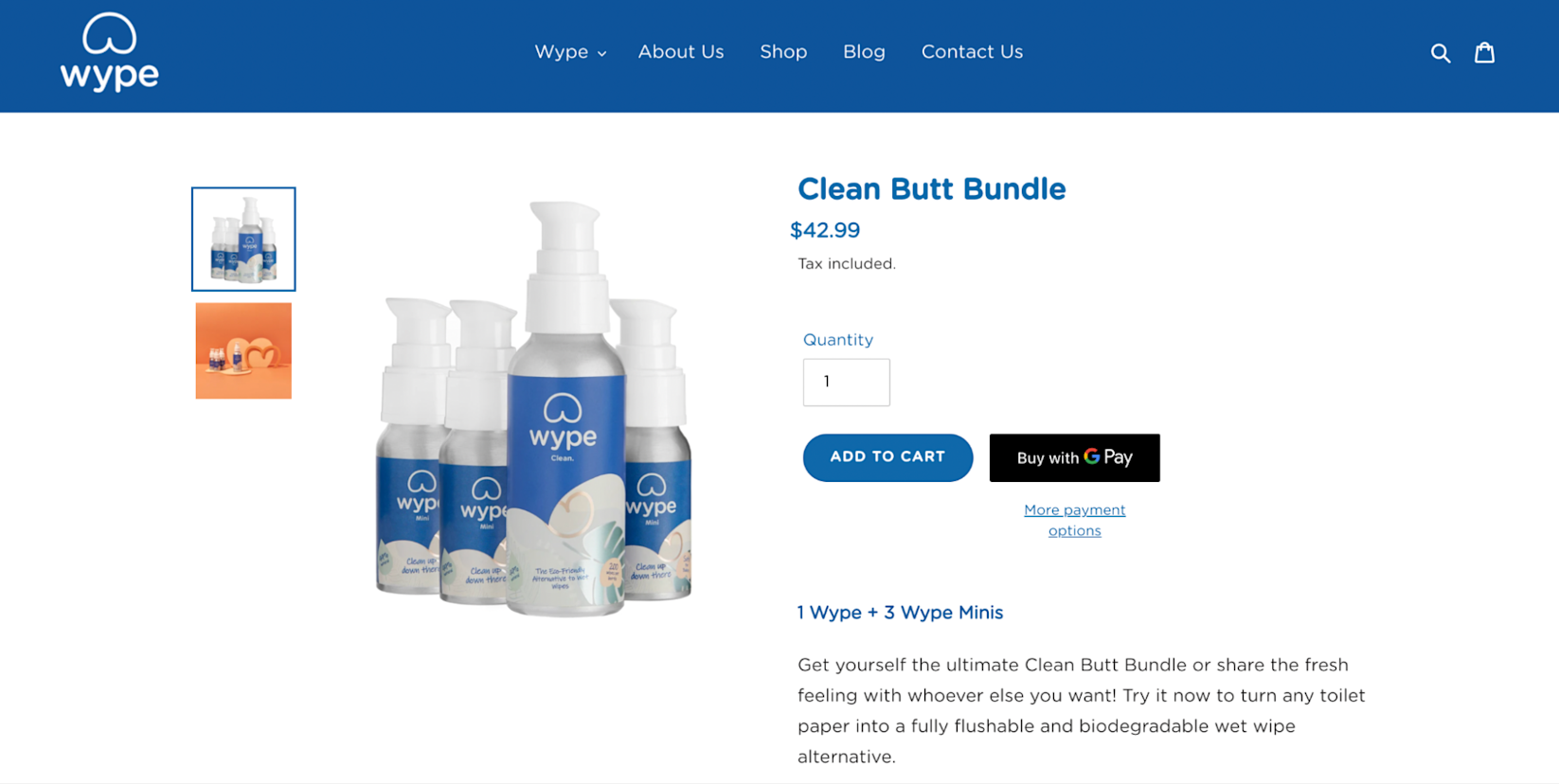
Wype’s ATC button is front and center on its product page, along with information about various payment options. If shoppers want to buy the Clean Butt Bundle, they know exactly how to do so.
Francesca Nicasio, Content Marketer atPayment Depotadds some helpful advice: “Also include a way for shoppers to take action at various places on the product page. Since you don’t know exactly when and where visitors are going to make their purchase decision, provide the means to convert throughout your page.”
Studies showthat a “sticky” ATC button can increase sales by 8%.
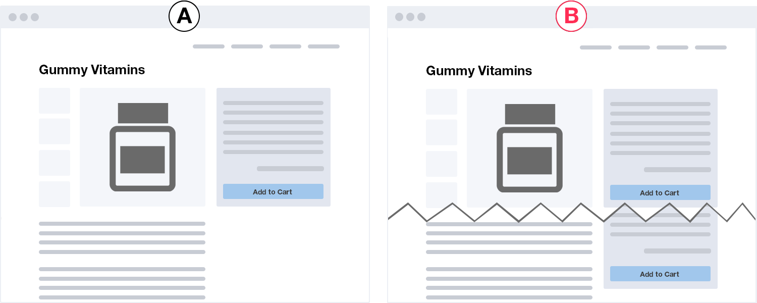
The same mindset—to “make action easy”—also applies to cross-selling and upselling, popular tactics for ecommerce product pages.
Justin Smith, CEO atOuterBox, employs “content wheels” on his clients’ product pages. “Content wheels refer to the content at the bottom of your product pages that provide additional context, product information, and related products and accessories. Content in these sections go beyond just a simple description and are designed to help customers make informed decisions while also directing them to useful resources,” he says.
High Point Scientificis an ecommerce store that sells telescopes and accessories. On its product pages, underneath the main product image and description, you’ll find a listing of recommended accessories. Below that, the site includes a more detailed description with an embedded YouTube video.
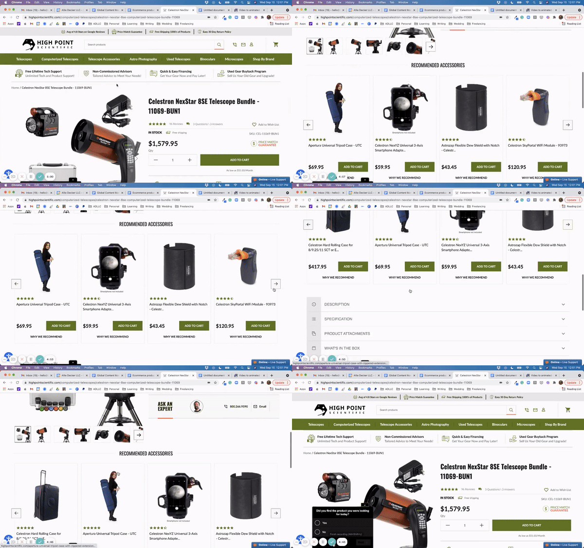
“We found that by creating content wheels like this, you not only improve your SEO rankings, but you also drive more conversions by providing more detailed and relevant information to your online shoppers,” says Justin.
最后,考虑一下你想要的动作流into the checkout process and payment methods. The truth is, most shoppers don’t enjoy a lengthy checkout process, especially with some retailers using quick-pay methods like Apple Pay andShop Pay. Those shoppers who aren’t 100% sold on your products willdefinitelynot wait through a long or non-linear checkout process.
When it comes to payment methods, offering as manyeasymethods as possible can help encourage your shoppers to take action. Adam Gingery, CEO atMajux Marketing, added Amazon Pay to a client’s website at the end of 2019 and saw increases across the board.
“From November 2019 to January 2020, we saw a 46% increase in site visitors starting the checkout process, a 44% increase in visitors selecting a payment method, and a 63% increase in visitors placing an order. Moreover, we saw 49% more site sessions include transactions and a 33% bump in revenue,” Adam says.
I highly recommend offering as many mainstream payment options as possible—including Amazon Pay, PayPal, Google Pay, and Shop Pay.”
4. Apply brick-and-mortar retail design principles
Bad design, cluttered elements, poorly displayed products—if you were to walk into a brick-and-mortar shop that looked like this, would you make a purchase? Probably not.
The same applies to your ecommerce product pages. If shoppers struggle to navigate your website, it’s highly unlikely they’d buy. Slow loading speed, poorly timed pop-ups, and bad imagery also prevent consumers from adding products to their cart.
Instead, keep your website free of clutter, which can also slow your website. Having less complicated elements can enhance the speed, performance, and even user experience.Calvin Kleinis a great example of minimalist site design that focuses on the CTA.
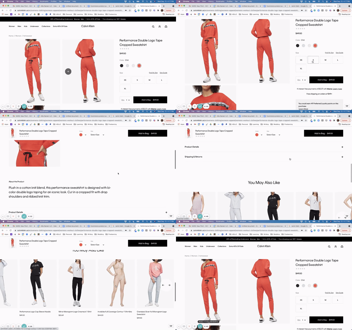
“Imagine your website as a storefront,” says Amy Block, Director of Marketing and Sales atNavitar.“窗户展示你最好的产品,我们lcoming prospective customers. The layout of the interior is made to draw customers to their interests, and related interests, then funnel them toward payment with excitement toward their purchase. Working this stylistic approach into your website is a great way to increase ecommerce success.”
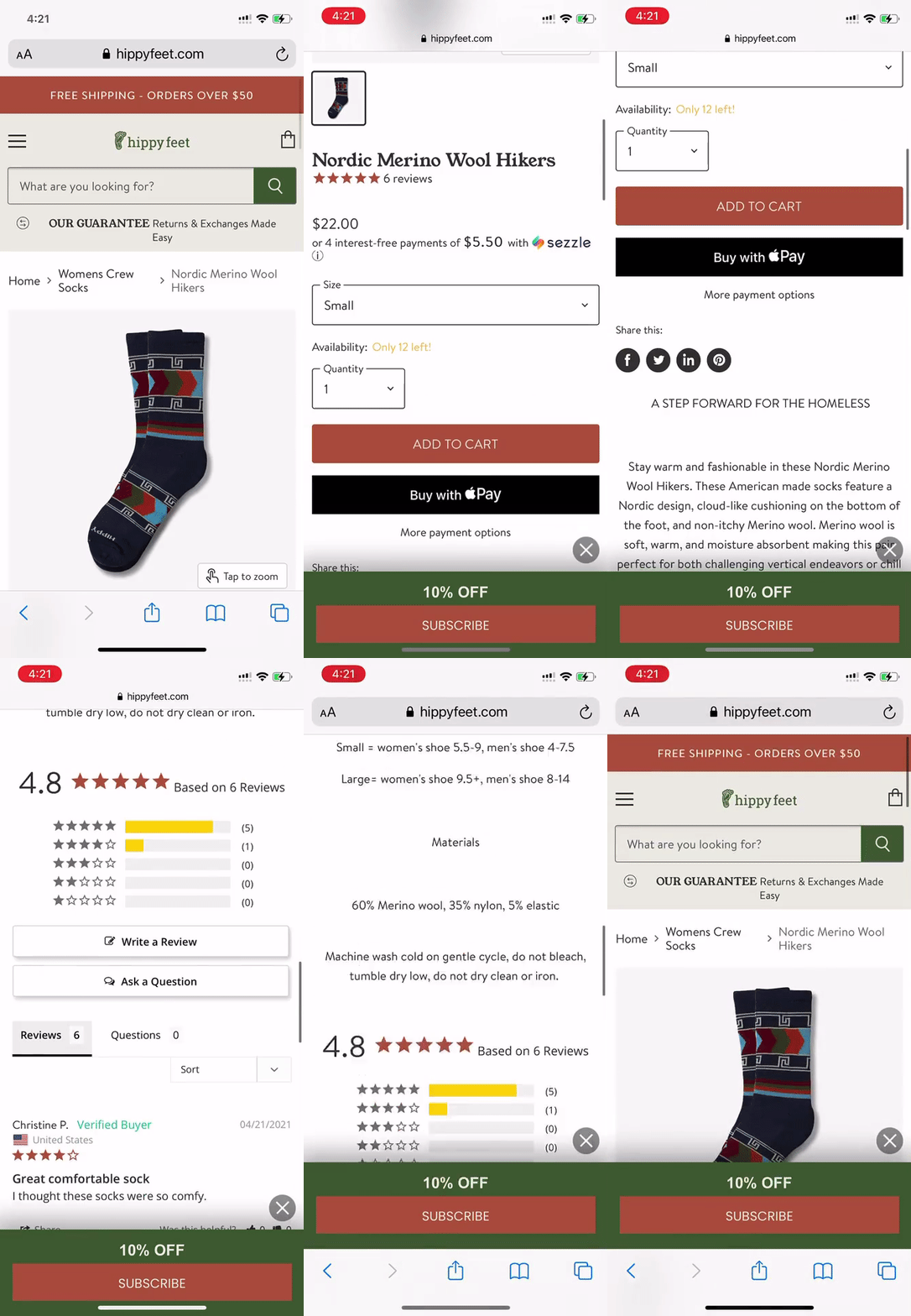
This approach also applies to your mobile experience. Sam Harper, co-founder at Shopify storeHippy Feet,considered this when deciding where to put the ATC button.
Knowing that over 70% of our potential customers are visiting on mobile, we need to look at CRO through a mobile commerce perspective. Store owners should try to position the button as high on the page as possible, preferably above the fold on mobile.”
Learn more:The Rise of Mobile Commerce: 11 Ways to Capture Mobile Spending
5. Check what’s leading your shoppers to product pages
Add-to-cart rates hover around10% for most ecommerce websites. Much of this has to do with the ads and landing pages that lead to product pages—and whether or not these accurately reflect the product(s) linked.
Referencing No. 3, consider how shoppers would feel if your brick-and-mortar advertising promised one thing but failed to deliver once shoppers made it to your store.
Identify what digital ads, landing pages, and social posts are leading to your product pages, and ensure the promised information and products are accurately represented.
“If you show product information in your ads, they should match your product pages. More often than not, customers bounce off product pages simply because they feel they have been misled,” says Alex Mastin, founder & CEO atHomegrounds.
Similarly, take a look at your homepage and ensure it speaks to your audience and flows well into the rest of your website.
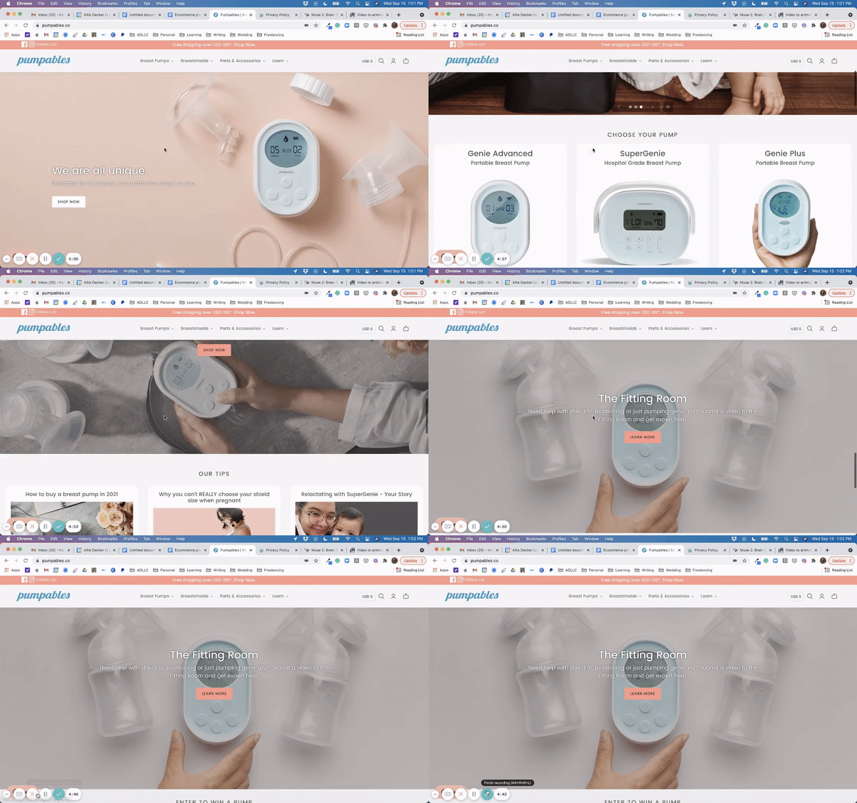
Referring back to the Pumpables case study, much of John Bluish’s ecommerce CRO work involved providing intent through customer direction and audience targeting on thePumpableshomepage.
“I did this by knowing who the target audience was: women. When they first hit the homepage, they’re met with a comment saying ‘By women, for women’ to immediately let them know they’re in the right place,” John says. “I also designed the homepage to reach all customers in all stages of purchasing.”
John placed Pumpables’ three product lines right after the hero image, for thosehigh-intent customers who know they want to buy. For those who may be indecisive and continue scrolling, they’ll find another hero image to emphasize the Pumpables mission.
Lastly, for those customers still scrolling and acquainting themselves with Pumpables, they’ll find a few commonly read blog posts and an interactive quiz to help them find their fit.
6. Create supplemental content
High-quality content builds trust with your shoppers—and this content doesn’t just refer to product copy. Consider how supplemental content, like care guides and best practice articles, might make a customer feel more confident in their purchase.
Shopify storeCritter Depotdid just that and saw incredible results.
“We optimized our conversion rate by creatingsupplemental宠物护理指导文章,称赞crickets and roaches we sell,” says founder Jeff Neal.
Our core customer is a caring pet parent. We believed that if we provided excellent information on how to provide excellent care to their pet, that would help convert those visitors into customers.”
The Critter Depot team hired a zoologist to write care guides onbearded dragonsandleopard geckos, and the guides ranked phenomenally on Google and brought in a whole new group of people that were unaware they could buy crickets online.
“When they discovered our content, they then discovered they could buy from our store,” says Jeff. “The articles led to a very low 36% bounce rate and a whopping 10% ecommerce conversion rate.”
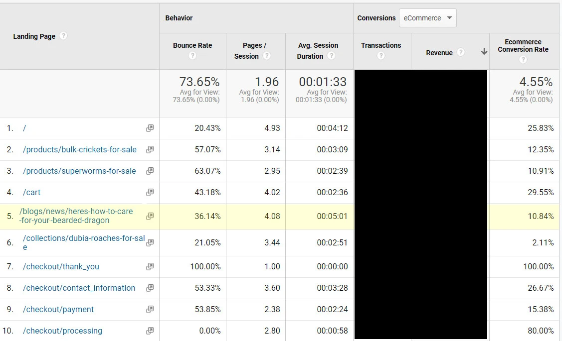
Creating content that indirectly helps your customers can be a great way to build trust, proactively communicate your authority, and optimize your ecommerce product page conversion rates.
The Secret to a Seductive Add to Cart
As I said before, your Add to Cart button isn’t the only thing responsible for its performance—despite how seductive it is. While it’s tempting to change the ATC color from red to blue and back again, much more goes into testing and optimizing your ecommerce product pages.
First and foremost, connect with your shoppers. They likely have lots of ideas about how you can improve your shopping and checkout experiences. Set up surveys, interviews, and user session replays to learn from them.
Secondly, follow some of the best practices I’ve mentioned above. Tweak one thing at a time—your product copy, social proof levers, page design, etc.—and see how your audience responds.
As you improve your ecommerce product pages with your audience in mind, you’ll see more action in no time.
Learn more:Ecommerce Conversion Rate Optimization: 19 Advanced Strategies And Tactics For Ecommerce Sites
