When you set out to create winning digital marketing campaigns that engage your target audience, you want the end result of those campaigns to be conversions.
And even if you put time and energy into tweaking the brand messaging and aesthetics of each email, blog post, paid ad, or mailer, sometimes small businesses get traffic that just doesn’t convert.
Table of Contents
While the culprit could be many things—the wrong messaging, a poor value proposition, or poor website navigation, to name a few—taking a look at your call to action (CTA) buttons is an essential place to start.
Below, learn how to write more effective calls to action and take a look at real life ecommercecall-to-action examples.
Get your free ecommerce copywriting template
Want to write compelling copy that convinces your website visitors to click, sign-up, or buy? Master high-conversion copywriting and increase your sales with our easy-to-follow framework.
Learn MoreWhat is a call to action?
A call to action (CTA) is a compelling statement accompanied by clickable buttons, that prompts immediate action from the audience. Typically found in marketing materials, websites, or advertisements, CTAs engage users and encourage them to click on specific buttons to perform desired actions, such as making a purchase, subscribing, or signing up.
What are the different types of calls to action?
Calls to action differ in the action they attempt to get shoppers to make.
There are three different types of calls to action:
- Buy now.A “buy now” call to action urges shoppers to complete a purchase. Because of that, it’s the most aggressive of the CTA types. Your goal with a buy now CTA is to place relevant and compelling offers in front of buyers that compel them to complete their purchase.
- Shop now.A “shop now” CTA invites people to take a look at your collection without feeling pressured to buy. This kind of CTA works well when you’re reaching out to people in your target audience who may not have heard of you before.For example, if you’re targeting a cold audience on Instagram for a shoe campaign, a shop now CTA makes more sense than a buy now CTA. It gives the viewer freedom to explore your collection versus feeling forced to buy right away.
- Learn more.Market researchshows that a shopper needs to know you, your reputation, and your product before they’re willing to make a purchase. So if your goal is to create an efficient selling engine that generates the most revenue at the lowest cost, strategic CTAs like “learn more” that invite shoppers to read more about your product, brand, and ethos can be critical to its success.
How many CTAs should you include in marketing content?
For email campaigns, it’s best to use only one CTA to keep analytics and A/B tests clean. This also helps focus your messaging and makes it simple for readers to engage with the email if they’re interested in learning more or making a purchase. The same goes for paid ads.
You might include a secondary CTA button in a blog post. For example, aside from telling readers to purchase your product or sign up for it, you could ask them to download an ebook, read a blog post that complements the one they’re on, or sign up for your email newsletter.
An essential part of optimizing a call to action is to A/B test new CTAs on your site and take note of which ones work best. Though it might sound obvious to say, remember that a compelling call to action for your brand will always yield more results than a lackluster one.
How to write a call to action
Writing a compelling call to action is a bit more strategic than just putting Buy Now CTA buttons on your site or in email marketing campaigns.
Using action words, considering the full customer journey, nudging your target audience toward a desired action, using urgency, and keeping your call to action above the fold are just a few of the techniques we’ll share below.
1. Consider the funnel stage
Funnel stages refer to the customers’ mindset on their path to purchase. It represents the marketing strategy used to turn prospects into paying customers. The goal is to map out the route to conversion and automate sales. Since you don’t have a sales person following up on marketing materials 24/7, CTAs encourage action instead.
At a high level, amarketing funnelconsists of three parts:
- Top of the funnel (ToFu):awareness stage where people learn about your product
- Middle of the funnel (MoFu):interest and decision stage where people are looking for solutions
- Bottom of the funnel (BoFu):action stage where people are ready to buy
The preferred call to action you should use varies depending on what stage of the funnel a shopper is at. First-time blog post readers, for example, will respond differently to a buy now CTA than an engaged email subscriber or loyal customer.
Jewelry retailerPura Vida Braceletsperfects the funnel using a series of CTAs. After you land on the site, a timed pop-up shows an offer for a 20% discount in exchange for your name, email address, and phone number. It’s low commitment and engaging for first-time buyers—because who doesn’t want 20% off of these awesome products?

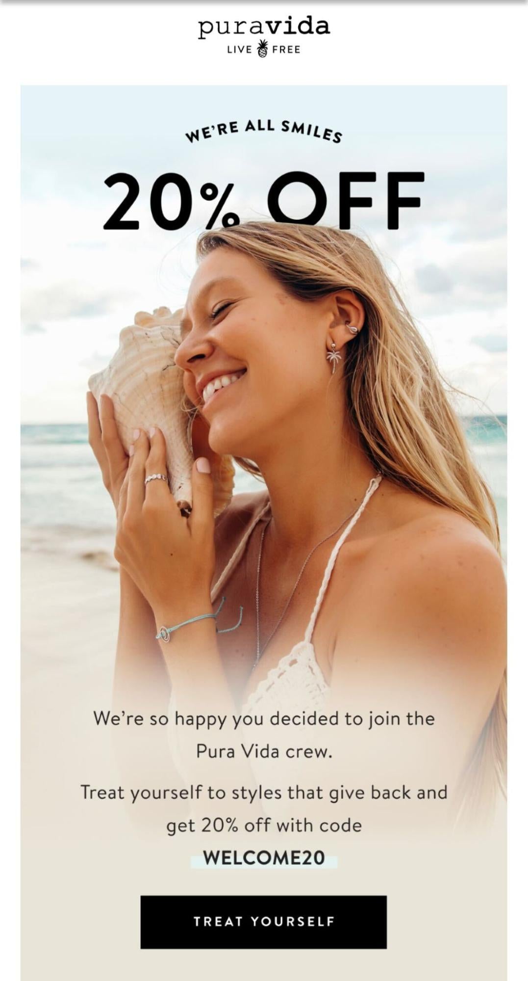
After completing the form in the pop-up, Pura Vida sends a confirmation email and SMS with the discount code. The SMS message uses a text-based CTA to click the link and use the coupon. The email uses the call to action “Treat yourself” to encourage clicks.
People are more warmed up here in the decision stage. They are familiar with your brand and its offerings, so a more aggressive call to action is acceptable.
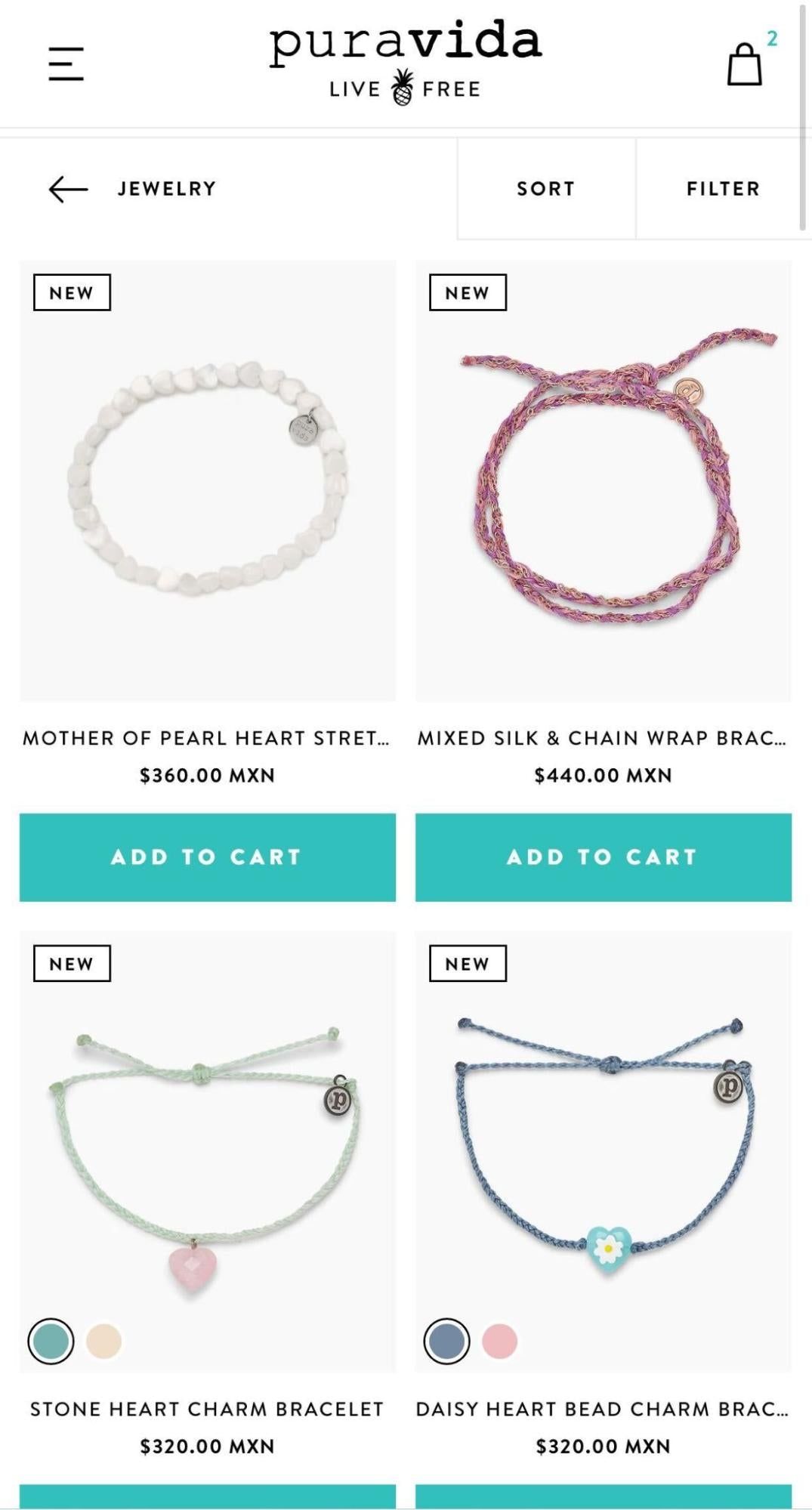
Pura Vida makes it easy to add products to your cart. You can read about an item on the product page and add it to your shopping cart from there or directly from the category page using an add-to-cart CTA.
After choosing your desired product(s), you can check out in your shopping cart by clicking the checkout CTA.

These targeted CTAs are used to engage visitors with the right call to action based on their intent and where they are in your funnel. When you’re creating a CTA, think about engaging your viewers based on their behaviors and mindset. It can help get your message across and encourage people to act on your offers.
2. Make early offers low risk
It should be easy for target customers to engage with your business. People are more likely to click on a button that’s not going to cost them anything or rope them into anything. And you can lead them to a landing page that gives you another chance to make a sale.
By offering something of high value (like a free-with-purchase item or a discount) in return for something of relatively low value or effort (like a social follow or email signup), you give your customers the incentive to engage. Who doesn’t want something free just for following an Instagram page, or a 15% discount for signing up for a newsletter?
A great example of a low-risk CTA isColourpop’s offer of a 15% discount in return for an email address. This is a no-risk offer to the customer—they don’t even have to commit to anything, just give out their email list for a good discount.

3. Use urgency to increase conversions
When shoppers feel an opportunity is limited, they’re more inclined to purchase. It creates a sense of urgency and triggers the FOMO in all of us. Arecent CXL studyshowed that adding a sense of urgency increased conversion rates by 332% for one online seller.
You can apply that urgency to sales and offers for your ecommerce store.
For example, you might highlight when an item is low in stock on its product page or via an email campaign, or create time-sensitive offers with wording like, “Buy now—only on sale until midnight.”
Notice how Pura Vida uses urgency in the example below. At the top of the checkout page, the retailer has the countdown message “Hurry! Your order is reserved for 9:31 minutes!” The brand will only hold your order for 10 minutes, max, implying that if you don’t complete your purchase it might sell out.

4. Test different colors
While there’s no definitive button color that converts best, it’s important to make sure you’re using a color that resonates with your visitors—and reflects your brand. The way to figure that out is by usingA/B testing. Create a few versions of the same CTA button using different colors and see which one generates a higher click-through rate.

Here are a few tips to consider when determining which color to use for your CTA:
- Use white space around your CTA to make it clear where to click.
- Select a color different enough from the background so it stands out.
- Keep things simple.
5. Use a simple CTA button and copy
It takes50 millisecondsfor a visitor to form an opinion about your website or ads, so it’s vital that you make it eye-catching and simple. One of the ways you can do this is by using buttons to direct visitors’ attention to the action you want them to take.

While most Shopify themes already include this feature, do make sure your CTA appears as a button and not just text. Even if it’s surrounded by a small border, it’s better than having just a text link.
⚡Tip:Cater your button copy to your product category and target market. For example, if you sell coffee, try changing the copy on your buy now CTA to “Get Brewing” and see if that helps with conversions!
6. Use captivating hero images
You can usehero images—the main, featured images on a website—to highlight a product or collection. In other words, they can be a massive call to action. Be sure to have your hero image link to a product or collection to get visitors to check out faster.
Gamestopdoes a great job of featuring new games on its homepage. It uses images that compel shoppers to find out more about the game, and clicking on the hero images takes them to a product page where they can complete their purchase. By using intriguing, linked hero images, you make it easier for interested shoppers to make purchases.

7. Keep it above the fold
The phrase “above the fold” comes from the newspaper industry, as the most important stories appear on the top half of a paper’s front page—the half you see when it’s on the newsstand or in a box. Below the “fold” of a storefront is the area of a website you can’t see until scrolling down. Any content above the fold is what visitors immediately see upon entering your online store.
If you can grab a visitor’s attention above the fold, chances are they’ll continue to click and navigate through your store.

Dr. Squatchputs all of the information you need well above the fold here. It has a call-to-action button in a prominent position, as well as all the menu options at the top. The copy is simple and prominent and its hero picture perfectly features its products.

Free Reading List: Copywriting Tactics for Entrepreneurs
Is your website content costing you sales? Learn how to improve your website copy with our free, curated list of high-impact articles.
Get our Copywriting Tactics reading list delivered right to your inbox.
Almost there: please enter your email below to gain instant access.
We'll also send you updates on new educational guides and success stories from the Shopify newsletter. We hate SPAM and promise to keep your email address safe.
14 examples of effective calls to action
Let’s take a look at businesses that use effective CTAs across social platforms, on their websites, and in your email inbox. The following list is broken down by channel:
Call to action examples for Facebook and Instagram
1. hideAWAY
hideAWAY’s homepage pop-up is nothing less than catchy. It uses emojis consistently throughout the copy and invites visitors to engage with Ashy, an international fitness coach, to motivate people to sign up for its Messenger and SMS marketing list.
The button is effective for two reasons. The Messenger icon informs a subscriber that the conversation will open up in Messenger. And, using words like “my” and “me” instead of “your” and “you” has shown an increase in conversions by up to90%。

2. Ladystrategist
帆布模板的创造者Ladystrategistpromotes a mini-webinar to grab the attention of potential customers in its Facebook ad. There’s a short video clip of ways to increase optimization of social media marketing templates, which details thevalue propositionfor customers. Ladystrategist then uses this piece of content to promote an 80%-off sale on its product.
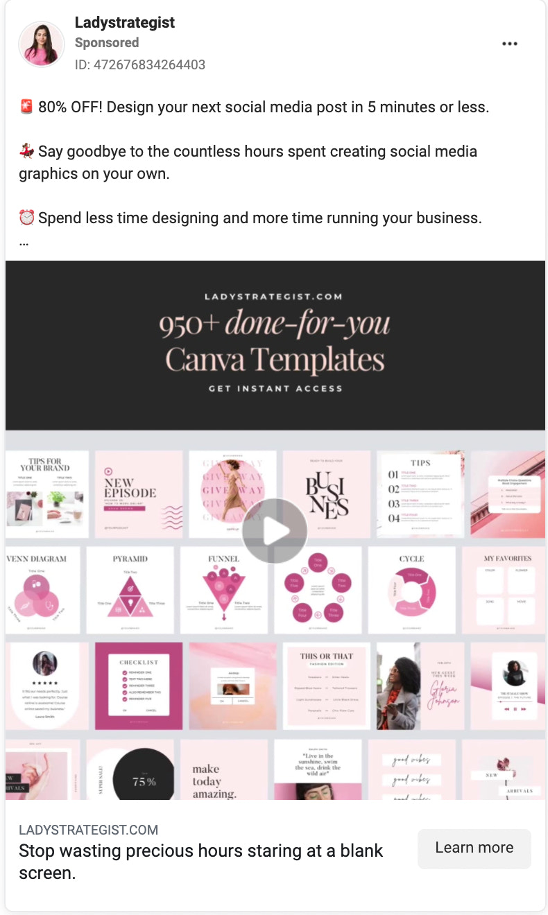
The brand uses action words like “design,” “say,” and “spend” in its CTA copy. This urges potential customers to take advantage of this opportunity to make their lives easier by simply clicking on the “Learn more” CTA button.
3. Slidequest
Slidequestgrabs its target audience by using its own product to create an ad. A video shows the available templates and infographics in the digital marketing campaign.

Within the video, Slidequest uses a combination of bright colors to gain attention and a muted white background so as not to overwhelm.The brand uses phrases like “unlimited downloads” and “lifetime updates” to pique interest, and also mentions popular programs like Adobe Illustrator and PowerPoint.
The cherry on top is the 50% off deal that Slidequest offers if viewers act now. This creates urgency by making the deal available only for a limited time. This encourages people visiting its social media pages to click on the link to its webpage.
4. Sephora
Sephora使用创建一种urgenc Instagram故事y. Here, it plays with shoppers’ sense of FOMO by using the action phrase “Don’t miss out,” and because it’s a Story, viewers only have 24 hours to click this link before it disappears.

A limited-time offer creates an even greater sense of urgency, even though we don’t know what the offerisyet. This also encourages followers to continue to check Sephora’s IG page every day, just in case there’s another offer posted on Stories.
Sephora has kept this ad simple. It’s only a handful of words on a yellow background, with a prominently displayed CTA button in white. But the mystery will undoubtedly result in lead generation and clicks to the website.
5. 5 Napkin Burger
5 Napkin Burgeris a full-service burger restaurant in New York City. The company wanted to attract new local customers and generate a database for future marketing efforts, so it ran click-to-Messenger ads with a Send Message CTA button through which potential diners could redeem a two-for-one burger special. Now that’s a juicy deal!

Below are the highlights of thisFacebook ad case study:
- 477 in-store offer redemptions
- 20% increase inaverage order value
- 10 times return on ad spend
- 2,500 new Messenger and email subscribers
- 17% redemption rate
6. Lyft
It’s clear thatLyft’s goal is to get you to download its app. Besides promoting a great deal (50% off your first five rides), it uses a photo of a woman in a face mask, subtly communicating you’ll be safe and secure when riding with Lyft. The description and CTA clearly encourage you to tap the Download button.

7. Walmart
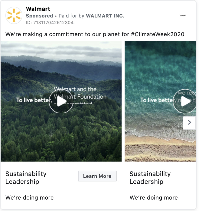
Walmartran a Facebook ad campaign to promote its sustainability leadership during Climate Week 2020. It used a Facebook carousel ad to showcase a series of videos promoting its work and overcomecognitive biasabout its brand. If shoppers wanted to read more, they could click on a Learn More CTA that sent them to another landing page.
Call to action examples for websites
8. FashionNova

这个报价窗口立即ly pops up upon visitingFashion Nova’s website. It captures the attention of website visitors and is a great first step to creating a successfulsales funnel.
An unexpected deal can do several things. First, it can prompt a visitor to actually buy something from Fashion Nova’s landing page when, maybe, they were initially only curiously browsing. Or, it can cause a customer to buy more than they’d intended to best make use of a good deal.
This pop-up window is simple but bold. It uses gold to make visitors mentally link it to something valuable, and it’s made to look like a scratch-off lottery ticket. This intends to make customers feel lucky and like winners for visiting the page.
9. Zanerobe

Men’s fashion brandZanerobegathers website leads through push notifications, which have a 30% CTR and can earn areturn on investment of up to 2,200%. When browsing the store, a small pop-up shows at the top of your screen with the above message. Viewers can click “I’m in!” to subscribe to the push notifications and get access to news and deals.
10. Pura Vida

Some82% of peopledon’t like website pop-ups. They appear everywhere online, oftentimes as soon as someone lands on a website. To combat this, Pura Vida uses an embedded CTA that blends into its category pages. As you’re browsing, you can easily sign up for its SMS list and get 20% off your order. It uses the CTA Sign Me Up! to encourage action.
11. Craftd

Men’s jewelry shopCraftduses a pop-up to grab your attention, share a targeted message, and build its email list. If you’re a new browser, Craftd offers you 10% off your first order in exchange for an email address. It’s well designed and relevant to its audience. There are no distractions because the store fades into the background, winning it more conversions.
Email CTA examples
12. Cotton Bureau

Cotton Bureau, a shop that sells graphic tees and prints custom designs, uses an email ad that hits a lot of CTA-marketing best practices.
在大胆的优惠,所以there’s no chance of overlooking it. The ad copy creates urgency, as this is a “while supplies last” opportunity. The call-to-action button is big and unmissable. Andallof this is accomplished above the fold.
13. Buck Mason
This email fromBuck Mason, a Los Angeles–based menswear brand, uses multiple CTAs that correspond to what it is promoting. For its Field-Spec Cotton Surplus Crew, it uses the CTA Shop Field-Spec. For its podcast, it uses the CTA Listen.
Notice how the context-specific CTA buttons feel more relevant than a generic Shop Now button you typically find in ecommerce emails.

If you want to promote different products or services in an email, create different CTA buttons for each to keep readers engaged.
14. Magic Spoon cereal
Readers can instantly relate to the title of Magic Spoon’s email “How to cure a case of the Mondays,”which helps elevate it above the other generically titled emails sitting in their inbox.
Magic Spoon电子邮件的设计也使其容易理解what it’s promoting and how to take advantage of it. Its eye-catching pink palette and creative imagery practically jump off the screen, leading you directly to a purple Order Now CTA button you can’t miss.

Create engaging calls to action for your marketing campaigns
You need a clear, persuasive call to action in order to improve yourecommerce metrics. Put the tips and tricks we provided to the test and try them out on your own ecommerce website or social media pages. Test out what works, and make adjustments to what doesn’t, then watch as your sales grow.
Ready to create your business? Start your free trial of Shopify—no credit card required.
Call to action FAQ
How do you write a call to action?
- Consider the funnel stage.
- Make early offers low risk.
- Use urgency to increase conversions.
- Test different colors.
- Use simple buttons and copy.
- Use captivating hero images.
- Keep it “above the fold.”


