Your ecommerce product page is where the majority of your customers finally make the decision to either buy your product or leave your store. Unfortunately, it’s an often-neglected part of the sales funnel.
While many store owners focus on improving their checkout page or tweaking what happens after a visitor adds a product to their cart, customers won’t get that far unless you create persuasive product pages that convert.
Product pagesexist to tell customers why your product is valuable and explain which needs it fulfills or problem it solves, and lists the product details a customer needs to see in order to make a buying decision. High quality product images and well-written product descriptions are important, but they’re also the table stakes—there’s a lot more you need to get right in order to make a great product page.
To help you increase sales and revenue, here are nine timeless ways to create high-converting product pages.
- Don’t wait to pique people’s interest
- Understand and address customer concerns
- Highlight a clear call to action
- Activate live chat on key pages
- Complement your photography with videos or GIFs
- Showcase reviews and testimonials
- Prominently display social proof and guarantees
- Upsell and cross-sell where appropriate
- Don’t leave your shelves completely empty
1. Don’t wait to pique people’s interest
In the world of journalism, every reporter is told to put the lead upfront. This means you start a story with the details that matter and never force people to dig in order to find essential information.
Store owners can learn a thing or two from this approach. While you’ll want to eventually cover the complete details of your product, a high-converting product page doesn’t leave potential customers in suspense—after all, it just takes a single click of the back button to lose a sale. All of your product pages must quickly and clearly state what a product is and why it’s valuable.

Vitruvicleverly applies this principle by providing a distilled summary of its essential oil diffuser product—what it’s made of, what it does, and how it will add to potential buyers’ décor.
Each of these individual ideas is explored in more detail further down, adding rich context, explanation, and images that help inform and provide proof of the claims made. But for most products, the choice to lead with “at a glance” copy is the right one, because the customer is never left waiting to have their interest piqued.
2. Understand and address customer concerns
Product page optimization begins with the understanding that there is an inherent relationship between the product, your customer’s motivations to buy it, and objections that may delay a purchase.
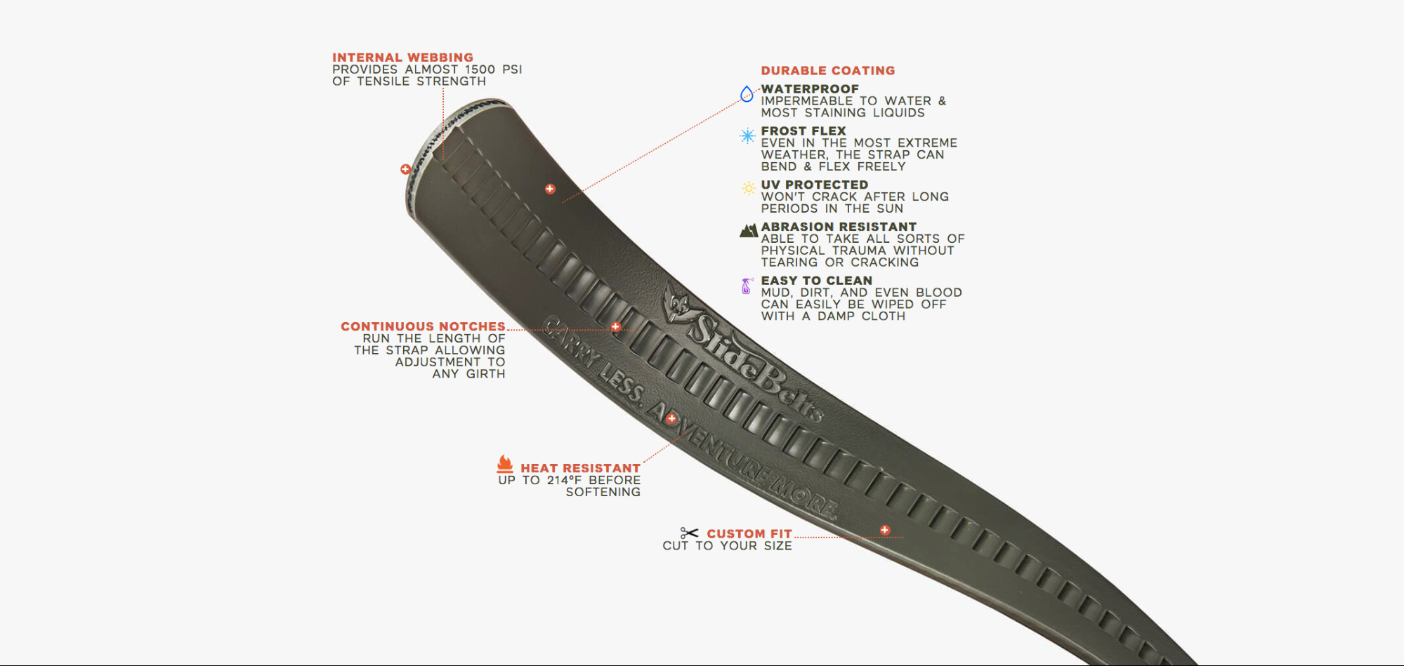
When selling itsSurvival Belt, for example, SlideBelts knows that customers have far more questions about functionality than about aesthetics. The look of the belt can be conveyed with a high-quality photograph, which leaves room for the product page copy to address durability and utility. For this product, focusing on how well the belt stands up to harsh environments and frequent wear and tear is essential to helping potential customers see the value.

Understanding how to convince customers and challenging your own assumptions through research are also important in increasing conversion rates on your product pages.
Start by understanding your customer’s motivations for buying your product and the objections or concerns they need addressed.
Kettle & Firesells a health product that it knows not every potential customer will be familiar with (“Why add bone broth to my diet?”). On top of that, the traditional approach to making bone broth comes with built-in hurdles around sourcing ingredients and time to prepare. This creates a natural opportunity for copy that leads with the hassles of the “old way” versus the comparative ease of using a Kettle & Fire product.

Note that while the potentialincrease in conversionsis one benefit, addressing common concerns can also help you set better expectations, which will reduce the number of returns on a product. Your support queue will thank you for your efforts of reducing customer frustration—the main source of which is receiving a product that doesn’t match their expectations.
3. Highlight a clear call to action
It seems obvious, but in pursuing a higher conversion rate on your product pages, make sure you don’t accidentally drown out the most important element: your add-to-cart button. Buying should be easy, which means your call to action should be impossible to miss, without being gaudy or clashing with your product page design.

Vermilyea Pelledidn’t have to compromise its sleek, minimalist design that prefers to take a back seat in order to build a high-converting product page that highlights its handmade bags. By surfacing the Add to Cart button up top and using simple language (because now is not the time to be clever), it’s easy to find your way to checkout.
4. Activate live chat on key pages
Live chat isconsistently ratedas having the highest satisfaction levels across all support channels; customers like that they get answers fast and multitask, and feel it’s the most efficient use of their time.
Just like an FAQ section on your product page, targeted live chat allows potential customers to get their questions answered quickly, making it easier for them to make an informed purchasing decision. The big difference is they receive their answer through a conversation, eitherwith a chatbotor by talking to you or your support team.
This means live chat can require manual work, and is often best to use during high-traffic periods (to close more sales) or on specific product pages, such as pricier bundles that generate higher than average order values.
Live chat also lets prospective customers know that you’re easily and quickly accessible, making your business more trustworthy. Even if your visitors don’t use live chat, just seeing that it’s available can give them that added peace of mind.

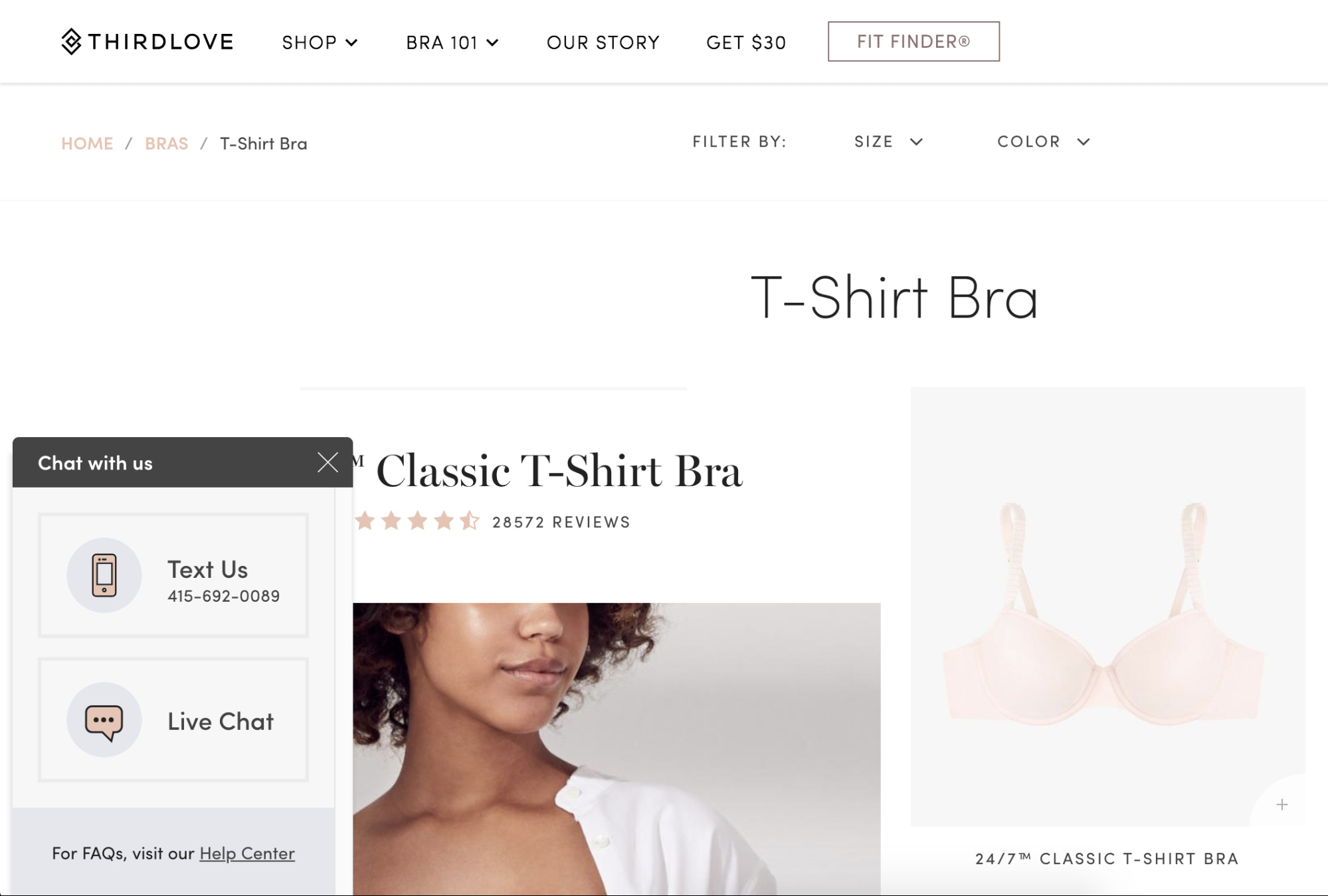
When your visitors do choose to use live chat, that’s your opportunity to help them address questions that may be stalling their purchase. You don’t have to be a salesperson; just be as helpful and transparent as possible. For example, having live chat available fits withThirdLove’sstated mission to help their customers find a bra that fits.
Leverage live chat with Shopify Inbox
Shopify users can add live chat to their ecommerce websites for free by installing the Shopify Inbox app. WithShopify Inbox, you can answer customer questions, make product recommendations, and drive sales from your computer or iOS and Android mobile devices.
5. Complement your photography with videos or GIFs
One of the obvious downsides of shopping online is not being able to touch, feel, or physically examine a product you’re considering. Because of this, high-quality product photos and other visuals can help provide a similarly useful experience.
We’ve long championed howproduct photographycan make or break any ecommerce site, but it’s important to remember that visuals aren’t just limited to photography, and effectively using visuals isn’t just about the aesthetics. Great photography, GIFs, and videos all keep your customers’ questions and concerns in mind and help them make a more informed decision.

Storq, which sells maternity clothing, emphasizes its soft, comfortable materials in its product page copy and uses video of a model wearing its clothes to show how a customer can expect each piece to fit.
Videos and animated photos don’t need to be lengthy or complicated, either. Just look at howKeySmartuses a simple animated GIF, with no audio, to show off its product in ways a still image or a set of images can’t quite match.

If your customerswerebuying this product in person, what would they closely examine? What would they want to see and compare? Online stores can bridge the gap by correctly using visuals to show customers what they’d naturally look out for when buying the product in person.
Last but not least, remember that while your product photography and videos live on your site, they’re often what’s used to feature and promote your products offsite, too. Wherever your products go, your photos and videos will follow, so they’re always worth investing in.
If you want to learn more about how video can help your ecommerce business, check out our brief guide tousing video to increase conversions.
6. Showcase reviews and testimonials
一般来说,产品的承诺specific positive outcome, the more valuable it is to have customer testimonials. That’s why online reviews have become essential for establishing trust in almost every product category.
Nearly95% of shoppersread reviews before making a purchase, and surveys haveconsistently shownthat customers trust reviews more than descriptions provided by the store or manufacturer.
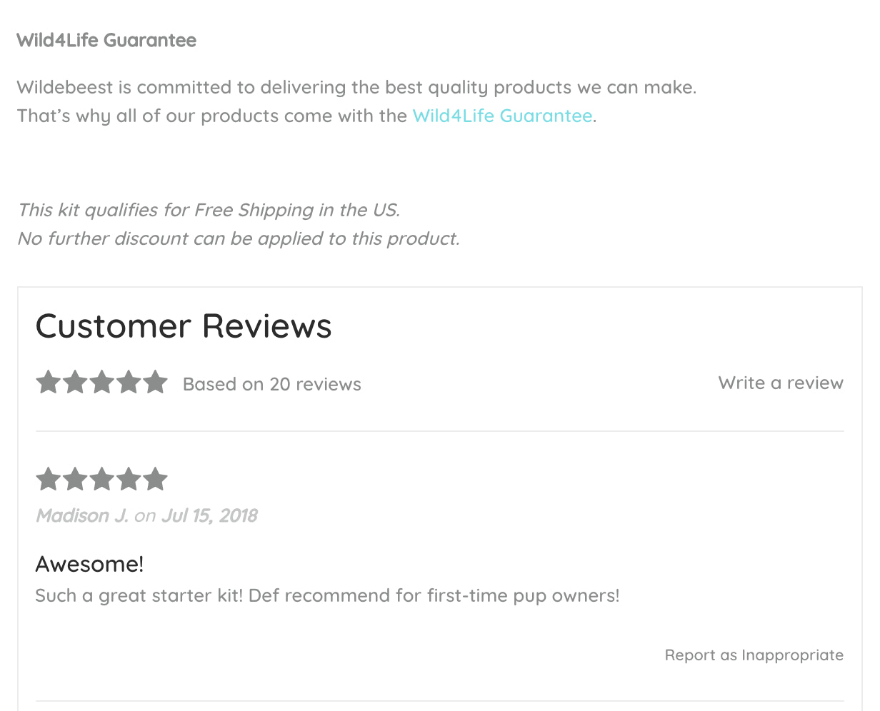
Since customer reviews are such a commonly used approach, look for ways to catch your customers’ attention or add to the social proof reviews naturally provide. Here’s howWildebeestpairs customer reviews next to its quality guarantee on every product page.

If you want to easily allow customers to add reviews on your product pages, head over to the Shopify App Store and choose from one of the many review apps. As a bonus tip, follow up with past customers a few weeks after their purchase and ask them to leave an honest review—email is typically the best channel to do this.
Nearly 95% of shoppers read reviews before making a purchase, which means reviews are essential for establishing trust.
If you sell a product that’s intrinsically tied to a personal outcome, like clearer skin or a better golf swing, testimonials will become a critical part of your marketing toolkit. Stars and quick blurbs are enough to sell a pair of socks, but probably fall short if you’re asking a customer to make a larger investment (e.g., a premium product or a personal product like skin care).

Great testimonials focus on real people and provide a story of life before and after your product.Luxy Hair’s products directly affect customer’s appearance, so to establish trust the brand liberally showcases transformation stories and each customer’s candid experiences with the product.
7. Prominently display social proof and guarantees
If your product is endorsed or given a reputable seal of approval, letting new visitors know with trust badges or seals can be a shortcut to establishing social proof.
Any certifications or important characteristics of your product, such as safety or legitimacy, are wise to include on your product page (so long as customers care about these aspects). It’s easy to simply write these things into your product description, but badges can save precious space for copy and stand out on your page.

The value of these badges is they quickly help customers check bottom-line concerns off their list (e.g., if a customer has a gluten allergy and requires a gluten-free product). Note that you may need permission or an official certificate to use specific seals or badges on your ecommerce website.
When you’re not referencing an official organization or standard (like “USDA Organic”), you can create your own badges that simply distill important product features. For example, features such as “Made in Canada” or “High Quality” would work better as nicely designed badges than simple bullet points in a product description.Primal Pit Pasteuses badges in such a way to visually summarize its products.

Another way to assuage customer concerns is to display rock-solid guarantees. What’s your return policy? What’s your customer satisfaction policy? Is it hidden away on a separate page for no one to see?
The types of guarantees you can feasibly offer depend on your products and profit margins, but clearly displaying what youcanprovide on your product pages is crucial for reducing ambiguity.
8. Upsell and cross-sell where appropriate
The goal of a product page is to sell. However, many online stores actually end up losing customers by cramming their product pages with excessive additional offers and links to related products.
Upselling and cross-selling can be key to increasing your average order value, but moderation and organization are paramount. Going overboard with related products and banners on your product pages can feel overly aggressive and spammy, cause decision paralysis, and distract shoppers from actually completing their intended orders.

Connecting the additional products to what a customer is currently looking at can make all the difference, and make your original product even more enticing.3sixteenrecommends complementary pieces to encourage shoppers to consider purchasing a complete outfit.
To boost your conversion rate while keeping buyers focused on the product they’re already viewing, display a modest amount of additional products, without overcrowding the space that you have.Slyde商店销售冲浪handboards,只有features its most relevant product add-ons, and right next to an offer of free shipping and promise of stress-free returns, which is a nice touch.

9. Don’t leave your shelves completely empty
A sold-out item doesn’t mean you have to lose a customer for good. When one of your products is temporarily out of stock, you can avoid losing future sales by giving shoppers the option to leave their contact information to be notified when the product is available again.
Greats, a footwear company from Brooklyn, often has limited edition sneakers available in special prints or made in collaboration with other designers. When a certain size isn’t available, customers are prompted to “skip the line” and get a notification when their size is back in stock.

Your Shopify theme may already have this functionality built in, but if not, you can check out apps likeBack in Stock. You can also look at other ways to capture leads on sold-out product pages, like a customizedlanding pageor offering pre-orders.
创建名单t pages that sell
Your product pages are the lifeblood of your online store. If they’re poorly presented or unstructured, you could risk frustrating your customers and leaving a lot of money on the table.
要通过创建额外的一英里高转换product pages will also do wonders for your store’s brand and reputation, separating you from your competition. The more effort you put into your product pages, the more interested shoppers will be in both your products and your company as a whole.
Sometimes, the smallest or simplest change can have a significant impact on your business. Start with strong ideas and iterate—you should begin to see your product page conversion rates rising higher than ever.
Illustration by Susan Haejin Lee

