Some of the best marketing content doesn’t seem like marketing at all. If you get an email from a company that’s useful, informative, and entertaining, it can seem less like an ad and more like a message from a friend. When done right, a good email newsletter as part of an effectivecustomer retention programinspires customer andbrand loyaltyandgrows your business.
But even the best newsletter content will get lost on readers if the design is confusing or not pleasing to the eye—which is where email newsletter design comes in. Ahead, learn how to make your messages stand out visually, with pro tips from a Shopify designer.
Elements of effective email newsletter design
A newsletter’s layout and aesthetics are key parts of connecting with a target audience. Ideally, the entire newsletter feels like a single, coherent piece rather than a mashup of graphics and text. Here are some design elements to include when crafting your email newsletter:
- Email header.Your header is an image that appears at the top of your email. Establish your brand identity by including your company logo in your email header. “Don’t feel like you have to use the same header in every email—be creative and engage readers with email headers of different sizes, colors, alignments, and treatments,” says Shopify product designer Laura Forbes. “But always ensure your branding is present and familiar.”
- Text blocks.Your text should appear in contained blocks, typically about one paragraph long.
- High-resolution images.The best email newsletters feature high-quality images (at least 300 dpi). Some tools offer drag-and-drop modules that help you place images exactly where you want them. Make sure you add alt text (alternative text) to your images to make them fully accessible for screen reader users.
- Responsive design.To meet user needs, emails must be built for desktop, tablet, and mobile. All mainstream tools, includingShopify Email, allow you to preview your designs across devices.
- White space.Some of the most important aspects of an email are the things youdon’tinclude. If you overload your newsletter with text, graphics, and background images, you create visual noise that dilutes your main message. Whether using an existing newsletter template or designing your own, include proper spacing and plenty of white space. This helps keep your readers from being visually overwhelmed—and steers their focus toward what you care about most.
- Call to action.A call to action, or CTA, prompts the reader to take an action like clicking hyperlinked text or images for more information. Common CTAs include “Read more,” “Learn more,” and “Download for free.” “You need to be mindful of how many CTAs you include in your newsletter—don’t overload the reader with decisions,” Laura says. “It should be crystal clear what action you want them to take.”
- Email footer.This section appears at the bottom of your message. You can use it to provide links to your website and social media pages. You may also be legally required to provide a mailing address for your company, and to offer an Unsubscribe button for those who want to stop getting promotional emails (most newsletter services, includingShopify’s, add this automatically).

If the idea of creating a newsletter with all of these design components feels overwhelming, fear not. There are resources available to help you find the particular template that best suits your needs. Leading email marketing platforms likeShopify Emailinclude design tools with pre-made templates that include all of these elements, from header to footer, and all the text and image blocks in between.
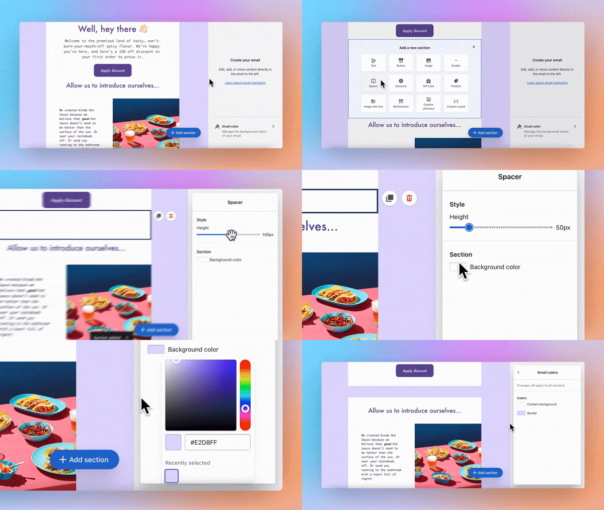
Shopify Email lets you build unique emails for your business.
Fully customize your layout by adding or removing sections, and go further by including discounts, products, images, text and more to suit your brand and the objective of your newsletter.
5 tips for designing an email newsletter
- Keep the design simple and easy to read
- Use a consistent template and color scheme
- Establish a visual hierarchy
- 建立层次结构通过排版
- Use responsive design to ensure compatibility across different devices
“你只有一扇小窗农业tunity to capture your reader,” Laura says. “Get to the point with short, snappy content and an impactful design. That way, they’ll be more likely to engage with your email.” Here are five email newsletter design tips to help you craft the best possible reader experience.
1. Keep the design simple and easy to read
Your design should serve your content, and not vice versa. Make sure to pick a design that aligns with thepurpose of your newsletter.如果你想要一个text-centric邮件读起来像a blog post, you may only need a single high-quality image to accompany that text—anything else might make the newsletter seem busy. Conversely, if your newsletter highlights your design portfolio, you can keep the layout simple with brief and descriptive text blocks.

2. Use a consistent template and color scheme
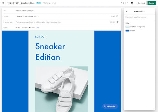
The best email newsletters have a consistent look from email to email. Pick a layout and a color scheme, and stick to it throughout your newsletter campaign. Not sure what that looks like? Check your own inbox for email newsletter examples. “Using a background color in your newsletter can add depth and visual cohesion,” says Laura. “Try a tint [a color with white added] or shade [a color with black added] of your main brand color and see what you think.”
3. Establish a visual hierarchy
A clear visual hierarchy keeps an email newsletter simple and easy to read. Include visual variety and group-related content together to engage readers from beginning to end. Also break up long text blocks with images, embedded videos, or interactive surveys.

4. Establish hierarchy through typography
Vary your text sizes, weights, styles, and even color. If a reader were to glance at your email, they should know where to start and be able to pull out the most important information. Use a maximum of three text styles or weights, and limit how many different text sizes you’re using. Choose a font that is easy and large enough to read—try a “classic” font like Arial or Helvetica— and avoid using images as text display, which isn’t accessible and may not scale how you expect on all devices in light and dark modes.
5. Use responsive design to ensure compatibility across different devices
Your audience will read your newsletter on a variety of devices—computer, smartphone, or perhaps even a tablet. They might read it within an email app or simply within their web browser. They also might download the message to a computer using major email clients like Microsoft Outlook or Apple Mail. Your job is to ensure that your newsletter looks great no matter what device is used to read it. This is where responsive design comes in. Leading email platforms offer responsive design to ensure that your text and images render properly so they are easy to read and view—no matter the device or platform.
Email newsletter design FAQ
How do you design an email newsletter?
Designing an email newsletter is made easier thanks to a number of email-building platforms on the market. Programs like Shopify Email, MailChimp, and Sendinblue feature customizable templates that let you include as much text or as many images as you like.
What format is best for an email newsletter?
The best email newsletter format aligns with yourbusiness goalsand brand. The owner of an ecommerce store selling apparel, for example, will likely want to showcase their products through high-quality images with minimal text. A consulting business, by contrast, might send quarterly updates that are primarily written, showcasing their ideas about the next big trends in the industry. These newsletters would prioritize text blocks over imagery. Choose a format that best highlights what you do.
How do I create an email newsletter for free?
Nearly all the major email creation platforms offer free tiers. That includes Shopify Email, MailChimp, Sendinblue, and MailerLite. If you have a particularly large mailing list or send high volumes of messages, you’ll likely need to upgrade to a paid plan with more features. Otherwise, as a small business or startup, free tiers may be sufficient—and with Shopify Email, your first 10,000 emails are free every month, no matter how many subscribers you have.
What should you not put in a newsletter?
尊重你的读者通过填充newsletters with content they find relevant and appropriate. Don’t blast your readers with sales language or a background image that doesn’t fit the messaging. It’s fine to feature products, but introduce them in the context of helpful text articles that are educational and entertaining. Be mindful—if the content seems relevant and respectful, then it’s probably a good fit.

