If more designers and developers would design primarily to reduce the bounce rate of the online stores they build, their clients would all be happy campers. Unfortunately, the reality is very different: The bounce rate is often an afterthought, much to the chagrin of site owners.
Thebounce rateis defined as the percentage of site visitors that lands on a page and only looks at said page before leaving—or bouncing from—your site immediately without interacting with it. The bounce rate is the killer of lead-generation, engagement, conversions, sales, and revenue. It has to be neutralized as much as possible.
Let’s talk about why reducing bounce rates is so important for your career, too. Here’s why:
- You make site visitors stay on your client’s site longer.
- They end up converting at a higher rate.
- Your client’s store earns more money.
- You look like a hero to your client.
- Your client is now your biggest evangelist marketer, telling anyone who’ll listen about your mad design skills.
It goes without saying that it’s in your best interest and your client’s best interest for you to design to keep the bounce rate very, very low. How do you do this?
Here are a series of actionable suggestions you can implement right away on your next design project!
Grow your business with the Shopify Partner Program
Whether you offer marketing, customization, or web design and development services, the Shopify Partner Program will set you up for success. Join for free and access revenue share opportunities, tools to grow your business, and a passionate commerce community.
Sign up1. Make site navigation a stellar experience
One of the most-cited reasons for high bounce rates is a site with a dreadful navigation. This stands to reason: If you’re a lead landing on a site from an organic Google search or a paid-search click on an Adwords ad and you see a chaotically cluttered page, you’re going to leave as soon as you arrived. No site visitor wants to be subjected to a page where he can’t find the information he’s looking for—which theSERP(search engine results page) description even told him your site would contain, no less!
As usability experts, the Nielsen Norman Group, point out,your homepage should have excellent usabilityfor two primary reasons:
1) Usually, the homepage is the most visited page on a site (it’s typically what shows up in the SERPs, more so than any other page)
2) The homepage is also the “orienteering” point for visitors on your site because it offers opportunities for further site exploration
Hence, a site that features very usable navigation is one that encourages visitors to explore it further, thereby reducing your bounce rate drastically.
As Neil Patel’sDaily Egg blog puts it:
“As a web user, when you visit a cluttered site where you can’t find the information you want, then there’s no reason to stay.”
So how do you ensure that your site navigation is top-notch? Try these tips:
- Don’t hide the navigation menu (no hamburger menu!)
- Use specific and clearly understandable labeling in the menu
- Use layered navigation and flyout menus if you have many pages and choices on your site
- Position the navigation in conventional spots, like horizontally across the top of the page or vertically along the left side of the page
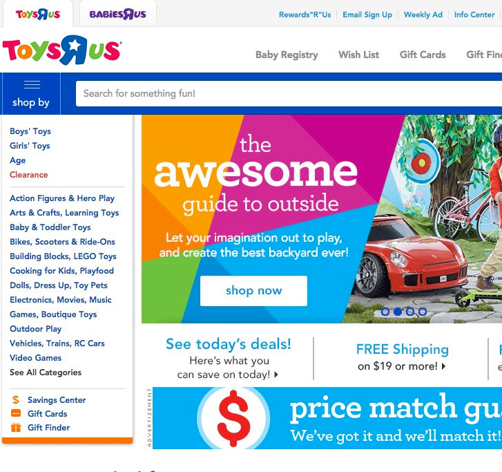
Toys R Us’ site is a good example of a usable navigation menu that empowers shoppers to quickly and easily find what they want. Note the horizontal navigation menus along the top of the page that feature helpful dropdowns, and note the vertical flyout menus on the left side of the page. For those searching for even greater specificity, the site lets them open a separate page devoted to navigating its many categories by clicking on the “See All Categories” link.
Keep in mind, though, that this navigation layout won’t work for all sites because Toys R Us is a special case: It’s a high-volume retailer of toys, which lets it get away with so many navigational categories in its menu. While this could be seen as choice paralysis for some, it actually excels for retailers with large inventories as it helps shoppers find what they’re looking for.
You might also like:A Quick Guide to Getting Started with User Experience Design
2. Align search campaign and landing page messaging
Okay, this one’s a bit more in-depth, so let me explain. As mentioned above, visitors will often land on your client’s page in one of two ways:
1) Through paid ads (paid search)
2) Through SERPs (organic search)
Let’s tackle paid search first. Ads likeGoogle AdWords包含短信劝说搜索click on the link that takes them through to your site. Usually, they’ll land on a landing page, appropriately enough. If you fail to design for consistency from the message and design of your ad all the way through to your landing page, your clients will endure a high bounce rate.
That’s because, asUnbounce’s slideshow on conversion-centered design建立,需要设计一些电话ed “conversion coupling.” This is a highfaluting way of saying be consistent in what you show visitors in your ad and landing page. If you don’t, then people clicking through to your page from the ad can become confused due to the break between what they clicked on and what they end up getting on your page.
By looking at Lexus’ Google AdWords ad and the landing page users click through to, we can see ideal alignment of ad and page messaging and design.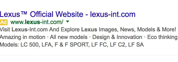 The paid-search ad establishes that visitors can explore Lexus news, models, and images when they click through. When one does click through to get to the landing page, visitors are immediately shown a new model in the rotating carousel, can click on the “News & Events” category, and can scroll down to look at various Lexus models.
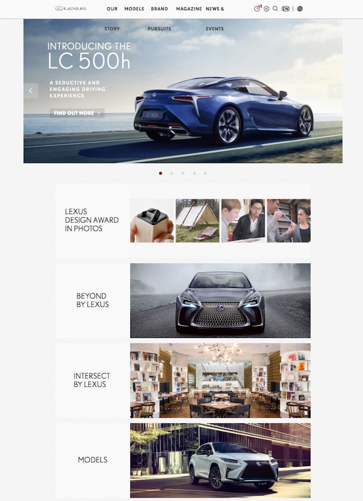 The other necessity with consistency ismeta descriptionand page relevance in organic search. People who are conducting searches for specific keywords will see page descriptions of different parts of your site in the SERPs, if you’ve optimized your site properly.
The trick to reducing your bounce rate when you’re getting this rich, organic search traffic is to ensure that the page really does show the info presented in your meta description. This isn’t rocket science, after all.
Picture this: Someone’s searching for RPG video game coverage and reviews. Your meta description for your site’s specific page is on the first SERP because you’ve optimized the page for keywords like “video game coverage” and “video game reviews.” However, when visitors click through to your page, they see new and used video games for sale instead! This is inconsistent with the meta description and so presents disappointed visitors with irrelevant info.
You can bet those disappointed visitors will bounce from your site immediately and, feeling frustrated, won’t ever return.

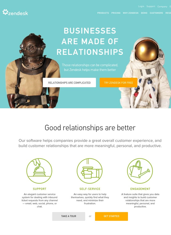
For inspiration and an example of great consistency between a page’s meta description and the ensuing page, look at Zendesk’s homepage meta description and its actual homepage. The info correlates perfectly, making visitors feel like they’ve found great relevance in their search.
You might also like:How To Create PPC Campaigns For Your Clients' Holiday Shopify Stores
3. Make your site blazingly fast
Speed is something you absolutely can’t compromise on when it comes to bounce rate. The Internet is tailor-made for instant gratification. Think about it: If a visitor lands on a slow-loading page and site, he can instantly search for another site with the same info or products that’s faster. All it takes is the click of the mouse or putting a new URL into the address bar.
To give your visitors more reason to stick around, look around your site, and then become a buyer, you have to make their user experience so enjoyable that they want to stay. You can accomplish this bymaking your site faster than ever.
This begs the question, how fast should you make your site? What research supports how quickly you should make your pages load?
For starters, consider that online stores could stand tolose as much as $2.5 million each yearin lost sales for each second longer that it takes pages to load! That is mind-blowing, but true!
Clearly, there’s a need to make your site fast, but what’s considered fast?
According to Web Designer Depot, design your client’s site toload pages between less than 0.5 and 2 seconds, at most. That may sound shocking to some designers, but consider this: Since at least 2010,Google itself has been using site speed as a ranking factorin website popularity in the SERPs. Six years later, speed has only gotten more important than ever.
Interestingly, though, you can get away with designing mobile sites to load just a bit slower. According to the Mobify’s slideshow (page 21),57% of your site’s shoppers will bounceif they have to wait longer than three seconds for pages to load.
The takeaway is that, in 2016, design pages to load between less than 0.5 and 3 seconds, and you should substantially reduce bounce rates for your clients!
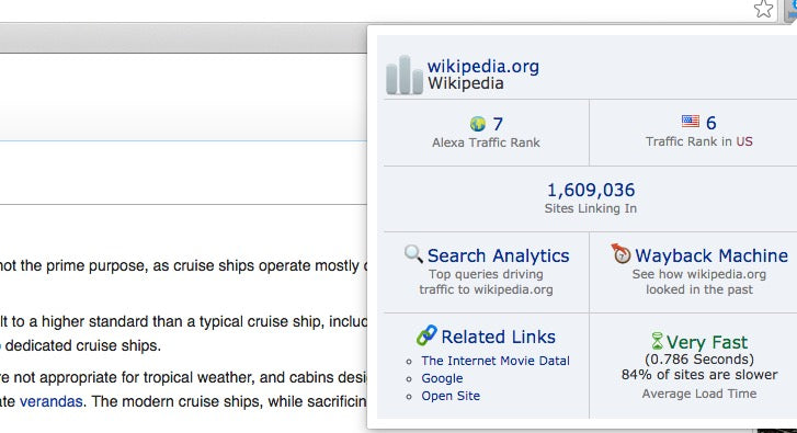
灵感是什么让一个网站的性能fast, we look to Wikipedia. The world’s biggest, free encyclopedia is one of the most heavily visited sites on the entire planet, and when we look at its speed, it’s not hard to understand why.
According to Alexa, the average Wikipedia page loads in just .786 seconds, meaning it reaches optimal load speeds. If only all sites can take a cue from Wikipedia!
You might also like:Why, How, and When to Utilize Usability Testing
Start taking bounce rates seriously
Your bounce rate is potentially the single-biggest indicator of the success of your client’s site. High bounce rates are due to massive and unpardonable issues with usability, the user experience and messaging, design and content irregularities. Many factors contribute to a high bounce rate, as we’ve shown.
Your job as the designer is to create the best-performing site possible for your clients. They rely on you for their revenue and livelihood, which comes from the traffic and sales of their sites. Don’t let them down! Now you know exactly how you should design to keep bounce rates very low and clients very pleased.
Here’s a roundup of what to do to ensure low bounce rates:
- Navigation that provides an excellent user experience
- Consistency in paid-search ads and landing pages and meta descriptions and site pages
- Insanely speedy page loading times
