In the bookAll Art is Propaganda: Critical Essays, George Orwell described the process of writing as follows: "When you think of a concrete object, you think wordlessly, and then, if you want to describe the thing you have been visualizing, you probably hunt about until you find the exact words that seem to fit it."
As designers and developers we have a number of tools at hand to help bring the authors’ ideas and intentions to life, from static images and graphics to videos and animations or GIFs. But a considered typographic concept is what will really invite the reader to immerse themselves in the text.
Think of typography as the anatomy of a piece of written communication: it is concerned with the function, structure and system of all parts; its appearance (shape, size) and position, materials, and the relationships between those. It brings the pieces together to a functioning whole.Good typography is barely noticeable, but is indispensablein helping the reader enjoy every aspect of the content in front of them.
You might also like:Why Fonts Matter: How Fonts Help You Build a Better Shopping Experience.
Static fonts and the web
Until the digital age, typography had evolved alongside our means of communication, with typographers primarily concerned with creating as good a reading experience as possible. But printed text is inflexible; its typography, materials, and production processes were based on an estimate of the average reader, their age, eye sight, physical attributes, reading habits, and reading abilities.
"Good typography is barely noticeable, but is indispensable in helping the reader enjoy every aspect of the content in front of them."
Since we started designing for screens, we not only had to consider the reader and their environment but also the medium itself, which has become an unpredictable variable. Unlike designing for print, we can no longer anticipate exactly how our content will be rendered.
Unfortunately, the digital typographic landscape hasn’t appropriately responded to this new challenge. In fact, with few exceptions, web typography is less accommodating than print typography.
There are two reasons why reading on screen is not given the attention it deserves:
- 之间的界线平面设计,网页设计,用户体验nd web development is increasingly blurred, with fewer professionals having knowledge of, or a sensibility for, micro typography and the history of letterforms. Without this knowledge, naive decisions are made around readability, legibility, typographic voice, and aesthetics.
- Comprehensive typographic hierarchies often demand a number of styles of a typeface family to be used, which contributes negatively to the page load time. Unfortunately, when it comes to choosing between good web performance and sophisticated web typography, the latter has often gotten the short end of the stick. Even the biggest type aficionados among us have to design within these tight confines.
The reality is that, in some cases,online experiences fail to match the typographic sophistication we are used to from printed text. Fortunately, new technologies give us the opportunity to solve these challenges and be more flexible in how we respond to both the reader and their environment, but these resources remain largely untapped currently.

Variable fonts
To improve the online reading experience,OpenType Font Variations, better known as variable fonts, have been introduced in a revision of the OpenType font format specification. The concept behind the technology is that variable fonts can package and deliver all styles of a typeface family much more efficiently than static fonts, the obvious benefits being improved web performance and greater typographic flexibility.
Axes
A typeface family is defined as a group of typefaces that are connected to each other, usually through common design characteristics. The most common parameters that link typefaces within a family are weight and width; those variables with are called axes in variable font technology.
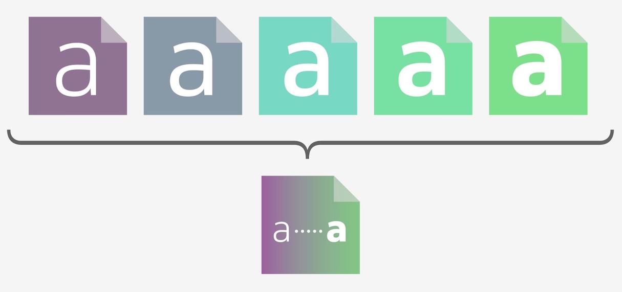
The amount of weights of a static font is usually limited to the fonts its designer makes available for purchase. A variable font of the same family would provide a continuous weight range, allowing for a near infinite number of instances to be used, all in one font file:

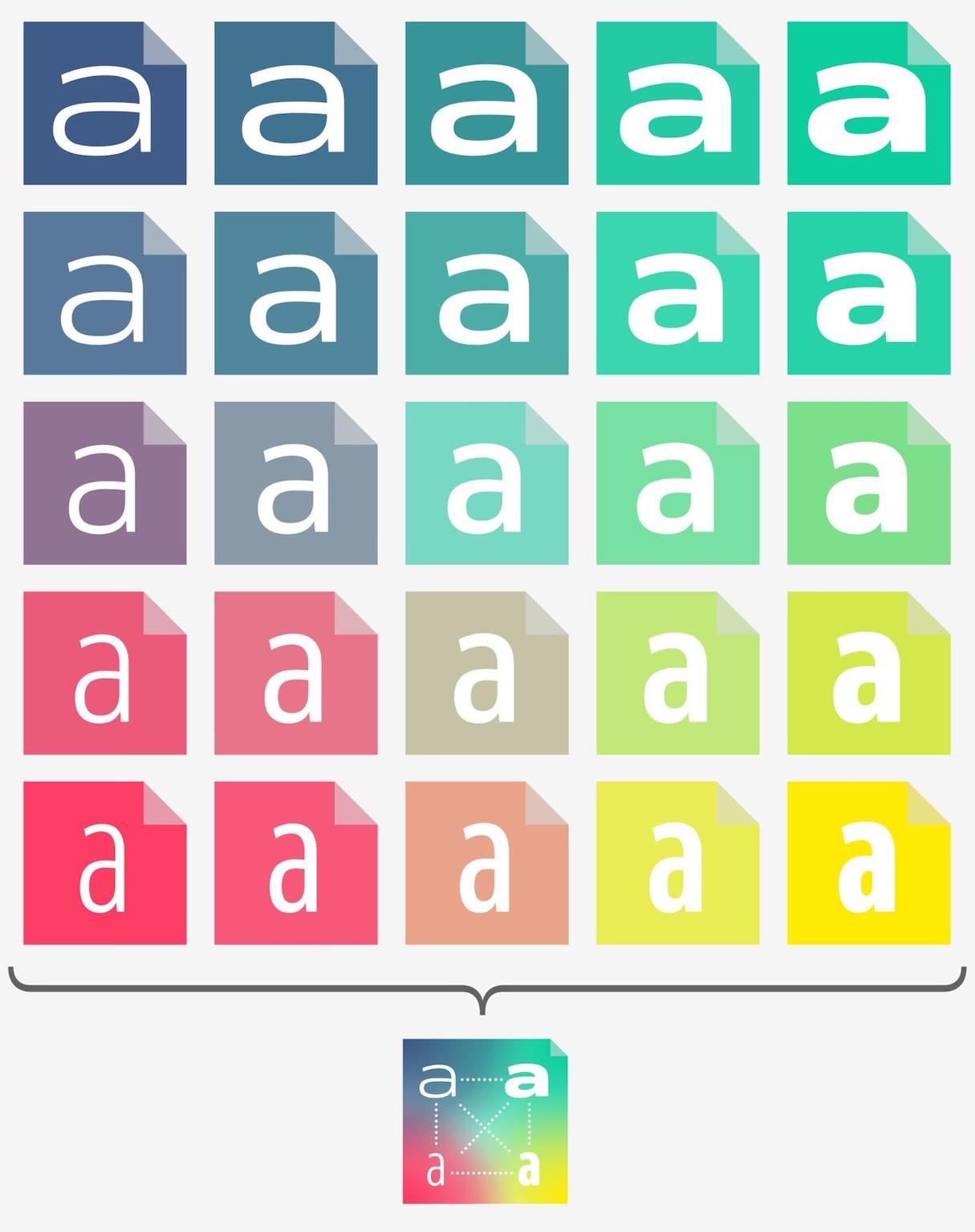
This flexibility could also extend to a second (or more) axis, for an ever greater range of expression. The following illustrates a combination of weight and width axes, all within one font file.

Five axes have been identified as particularly useful and common and have therefore been registered in the OT spec:
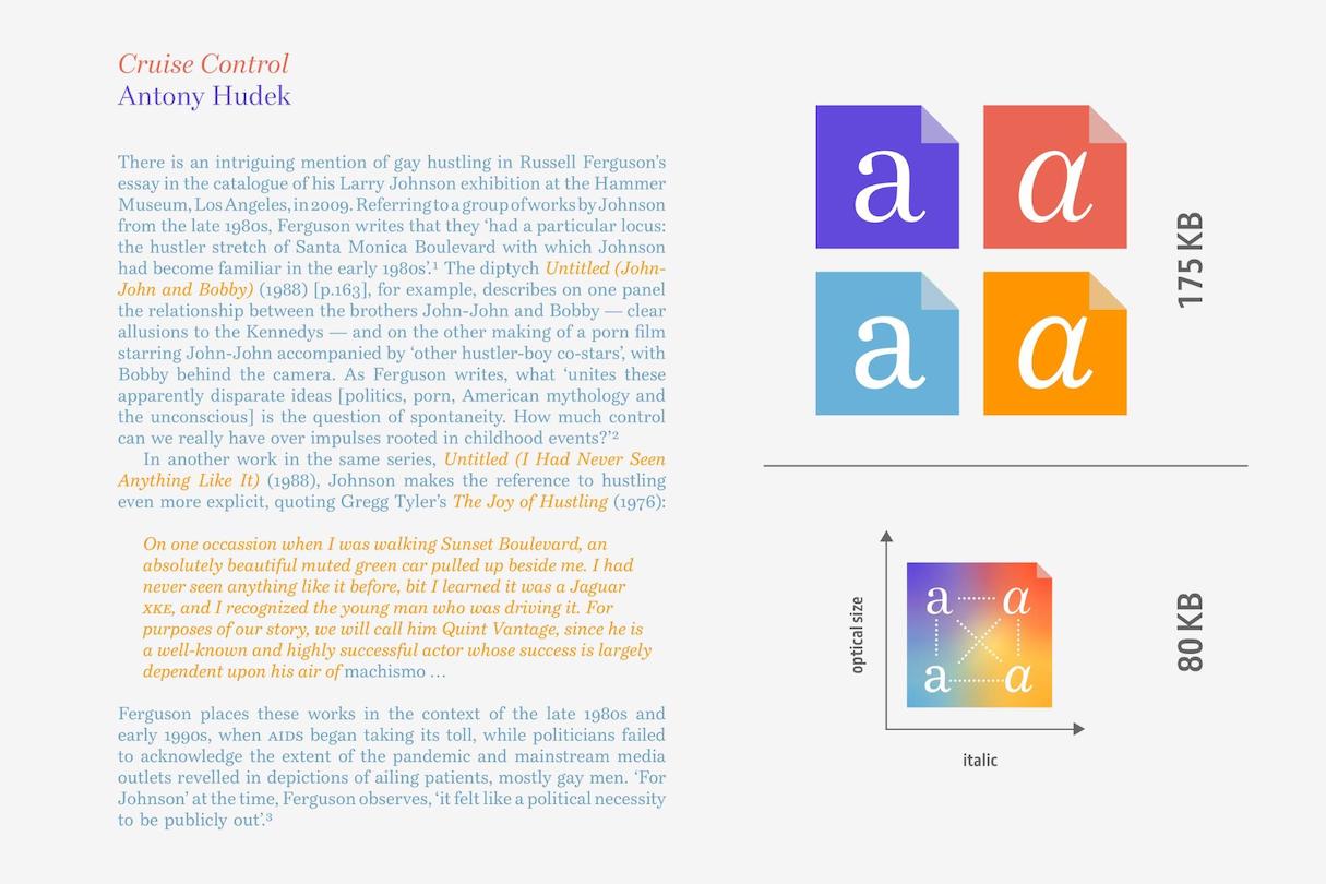
ital: A binary axis used to vary between roman (upright) and italic letterforms. Italics are often used to emphasize phrases, highlight foreign words, or for quotations. The font-style property with the value set to “italic” can be used to access the italic letterforms.opsz: A continuous axis used to vary design to suit different text sizes. Size-specific designs are meant to compensate for the loss of fine details in small sizes. The aim is to optimize legibility at small sizes, and optimize personality at large sizes. Optical size values are intended to be automatically adjusted corresponding to font-size. A new property, font-optical-sizing, has been created to turn optical sizing on or off.slnt: A continuous axis used to vary between upright and slanted text. As opposed to italics, this axis allows you to manipulate the angle of oblique slant in a typeface. The font-style property with the value set to obliqueangle, with an angle in degrees, can be used.wdth: A continuous axis used to vary the width of letterforms from narrower to wider. This might come in handy when used to make micro typographic adjustments to paragraphs. Depending on the range of the width axis, the extremes are often more expressive and lend themselves for use in headlines. The font-stretch property can be used to access the width variants, with values below 100 percent for the condensed variants and values above 100 percent for the expanded variants.wght:一个连续轴用于中风thicknesse不同s to give variation from lighter to bolder. Similar to italics, a bolder weight is often used to emphasize words in a text set in Regular or Book weights. The letterforms generally become more crowded in the heavy end of the spectrum and more fragile towards the lighter end. Consequently, more extreme (and usually more expressive) weights are often used for headlines. The font-weight property can be used to access weight variants.
Typeface designers can create and combine axes beyond the above as they see fit but interoperability can’t be guaranteed for unique axes. You can use these four-letter tags in CSS to specify a point along that axis of variation, as will be shown in the code examples below.
You might also like:How to Use Shopify’s New font_picker Settings.
Integration
In order to start using variable fonts we need to link them:
@font-face { src: url('[URL to woff goes here.]'); font-family:'Venn'; }Axis settings can be manipulated in much more granular fashion than we are used to from static fonts. For example, to set font-weight and width using font-variation-settings, you could do something like this:
font-variation-settings: 'wght' 557.5, 'wdth' 83.13;This is the low-level equivalent to the basic properties:
font-weight: 557.5; font-stretch: 83.13%;These could potentially be used in combination with media queries like prefers-color-scheme or light-level.
Support and fallback
Variable fonts aresupported by all major browsers. A default instance is defined in the variable font to fallback on if viewed in older browsers. Best practice, however, is to use the equivalent static webfonts as the first fallback option instead to match the originally intended design of the website. An example of how this could look can be found onCodePen:
See the PenUsing a variable font with fallback fontsby Oliver (@glyphe) onCodePen.
Adoption
The potential of variable fonts to enhance our reading and user experiences are undeniable. While the technology is still very young, some early adopters already show off some of its possibilities. For example, Clearleft chose two different variable font families, each with a weight axis, for theAmpersand Conference website. Oliver Schöndorfer is pushing it to the extremes by using 18 different instance of a single two-axes variable font on hisvariable font demo page. Beyond the purely typographically interesting examples, Goertek has commissioned an expressive variable font thatresponds to sound, and developer Andrew Johnson is also experimenting withvariable fonts in augmented reality.
Especially these early responsive experiments inspire thoughts on how variable fonts will enable text to respond to the user and their environment, making the written word more expressive and more accessible, without impacting web performance.
Resources to Grow Your Skills
Get your free copy of the Project Scheduling Template sent directly to your inbox.
By entering your email - we’ll also send you marketing emails related to Shopify. You can unsubscribe anytime.
Resources
Variable Fonts:Support:
Testing:
Responsive Variable Fonts:
Variable fonts—the time is now
As variable fonts are now supported by all major browsers, there is the potential to start using this technology already to improve general standards. This could be as simple as making fine typographic adjustments to present content in the best way possible, or enabling typography to truly immerse a reader with their environment and medium.

