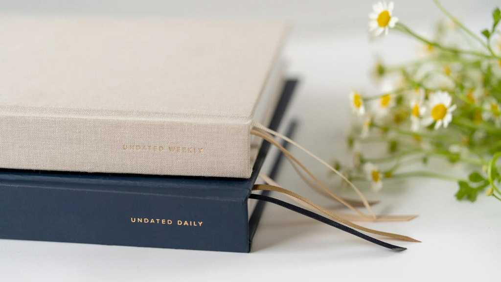
Tia Masic had used planners her whole life, but if she wanted one that was locally made, she found out that she’d have to make her own.
Hemlock & Oak was born out of her desire to create Canadian-made planners that were more sustainable and ethical than the other options on the market. A successful Kickstarter campaign in 2020 proved that she wasn’t the only one who felt that it was a gap that needed to be filled.
Since then, the brand’s product offering has grown from a single dated planner to a full spectrum of colour options and customizations. In the last three years, the brand has picked up thousands of fans that are as passionate about local production, sustainability, and aesthetics as its creators are.
To differentiate its buying experience from competitors, Hemlock & Oak wanted to make its online checkout the fastest and simplest for its customers. To eliminate barriers to buying and maximize conversions, Hemlock & Oak switched to Shopify’s one-page checkout.
Since switching to Shopify’s one-page checkout, Hemlock & Oak has:
- 在线checkou大幅减少摩擦t
- Lifted online conversions rates by 7%
- Increased pre-orders by allowing for split payments
Challenge
As a niche brand in a product space dominated by larger incumbents, Hemlock & Oak is constantly looking for ways to win customers from their competitors. To be competitive, the brand knew its online store had to win on experience: faster, straightforward, and functional.
They noticed top-tier brands were using a single page checkout that felt dramatically faster than its own. With the checkout flow being an important driver for sales, they needed a cost-effective way of streamlining their own buyer’s journey. But they worried a single page checkout experience was only accessible to big brands with bigger budgets and in-house development teams.
Solution
When Tia learned about Shopify’s one-page checkout, she immediately recognized it as an accessible way to improve Hemlock & Oak’s checkout experience, reduce friction, and go head-to-head with big brand competitors.
Implementing Shopify’s one-page checkout was fast and didn’t require any help from developers. The checkout experience was markedly faster and more streamlined, which had an immediate impact on abandoned carts and conversions.
Results
Once one-page checkout was live on the brand’s site, Tia started taking advantage of newly available features to convert more browsers into buyers. She made split payments available, which increased the number of pre-orders, and showed shipping costs earlier in the buying journey to help shoppers feel more confident making a purchase without the risk of surprise fees.
“Apart from improving our product, we are constantly trying to improve the customer experience,” explains George Sarnetsky,Hemlock & Oak's Chief Operating Officer. “Shopify’s one-page checkout makes buying from us really straightforward for customers by showing them all the information they need to transact with confidence, faster.”
Since turning on Shopify’s one-page checkout, Hemlock & Oak has seen a 7% increase in online store conversion rates, and has seen a lift in pre-orders with split payments. The brand expects those figures to increase even more once they release their new product line later in 2023.

