-
So, let's get into the designer mindset. As an entrepreneur, you have to wear a lot of hats. Marketers, product developers, customer service reps and writer, just to name a few. Design may not be the reason why you got into entrepreneurship, though it's an important aspect to build your e-commerce company. I'd like to get you started on the initial design for your store by creating a moodboard. A moodboard is a collage of ideas, images, colors, fonts, that will serve as inspiration for creating your Shopify store.
-
This will be helpful for designing your store when you do it yourself, or even if you try to outsource your design, it's very important, since a designer may ask you for a moodboard or a brand guideline. When I work with clients, this is a great place to get started and understand their online vision for their online identity. You can create a moodboard on a large billboard at home or digitally. You can use Pinterest or even Google Docs, but I highly recommend trying out a tool called "Boards" by a company called InVision to start collecting your visual inspiration.
-
It's a free and fantastic tool to see all your design inspiration come to life. So, start taking screen grabs of fonts, colors, imagery, navigation, copy, product pages, that'll inspire you to add to your moodboard. I want you to take some time to do this before getting too deep into the principle of design. This will help you discover the type of imagery, product, photography, copywriting and overall designs that will spark inspiration for your store.
-
I recommend finding between five to ten images just to get started. You'll probably end up taking bits and pieces of everything you collect and then putting them together for your own brand identity. So, let's get a bit deeper. There are three core elements of brand identity that you can pull out of your moodboard. First, your color palette. What are the colors you want to represent your brand?
-
What colors look good together? Colors are an important part of your toolkit. They can elicit certain emotions from your audience, but at the same time, direct their attention. One quick tip to note about your colors is that it's important to make sure your colors are contrasting well. For example, if your product description or website copy is difficult to read due to the color of the text, then it might be wise to change the color to work in your favor.
-
Remember, you have your brand architecture to guide you. I can look at my brand pillars and start to answer this question I want colors that are natural feeling, like greens or browns to communicate the environment, but at the same time I want my colors to stand out. I still want to communicate that joyous feeling to my brand but also want to select an eye-catching color from my main action items on my site.
-
When we get to building out our shop, I'll use a bright yellow and orange for the parts of the website I want to stand out, like buttons, or telling the user to shop or buy. The second elements that are going to come with my moodboard is the photography and visual style. Do you like the images with a lot happening? Do you appreciate a lot of whitespace? For me, I like images of nature, since my mission is to ensure we're lowering the impact of technology on the environment.
-
I'm going to find a lot of visuals that incorporate my target audience of yogis into natural settings. A great resource for finding free stock photography is Burst, developed by Shopify, which is a free stock photo library and you can check it out in the link below. Lastly, your moodboard is going to highlight the kind of fonts you want to use. Sometimes, fonts are referred to as typefaces or typography, but it's all the same at the end.
-
你的品牌字体的选择是非常重要的,而且我know, sometimes it seems slightly ridiculous to think that letters would influence how people would interact with your brand. Lots of studies, however, show that it does have an influence on your audience's sentiment towards your brand. And I can tell you, from what I've seen working with entrepreneurs, fonts truly do matter. You'll want to find something that really reflects your brand pillars, as well.
-
In my case, I'm going to find a font that's grounded, yet has some pop to it, to really get the fun, joyous feeling. Let's be real, I'm not going to find a font that is defined as "grounded" or "joyous". It takes searching, and it takes feel. At this point, really nail down your brand pillars into your mind and start searching for fonts that represent these pillars.
-
You'll know when you'll know – this is a part that's more of an art than an actual science. Shopify has an extensive font library and it's always growing. I've included a handy link below, so you can see the full font catalog yourself. You can also get font inspiration from sites like DaFont.com, Fonts.com or even Google Fonts. If you've found a font that's in a magazine or an ad that you really like, use an app like "What the Font".
-
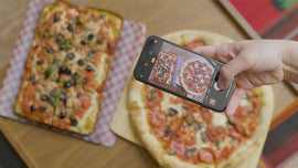
You can take a picture of the word, upload it, and you'll learn what the font is immediately. It's pretty amazing. All right. So you're working on your moodboard and you're keeping an eye for the color palette, the visual style and font choice. Now, let's start building! In this next lesson, we're gonna bring your brand to life.

