Flat Lay Photos: Pictures of Flatlays
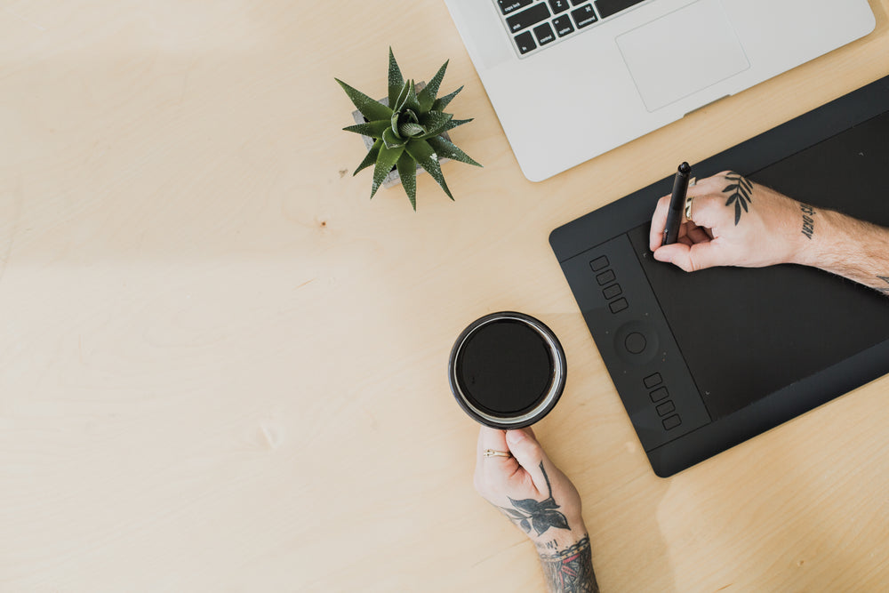
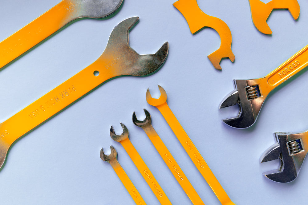
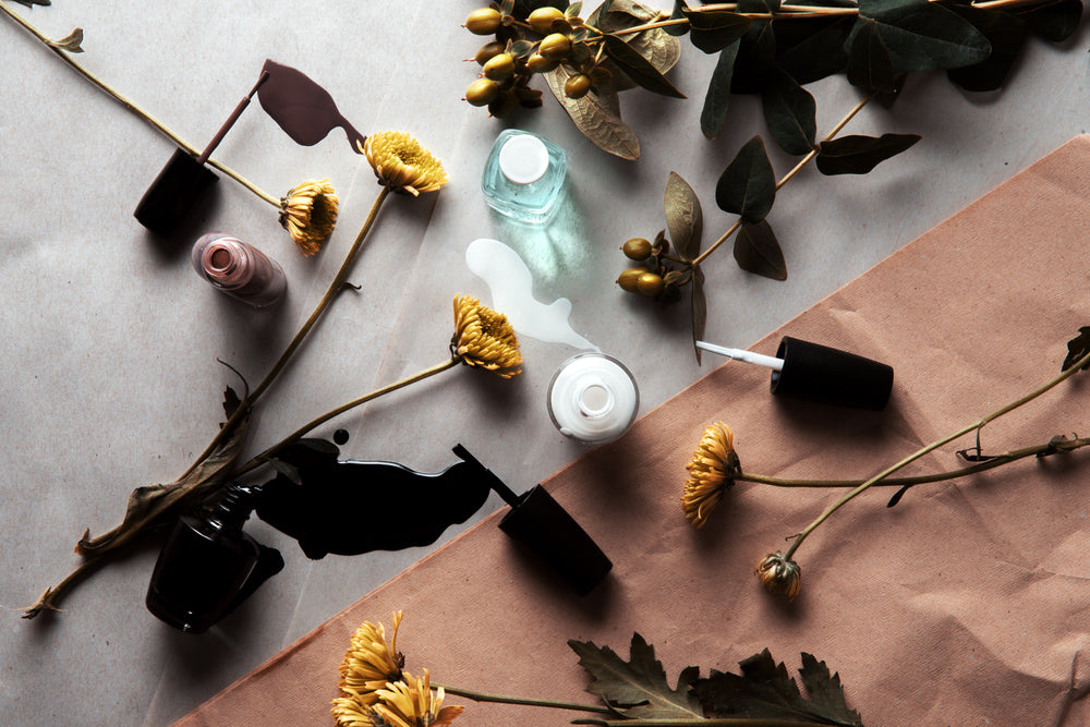
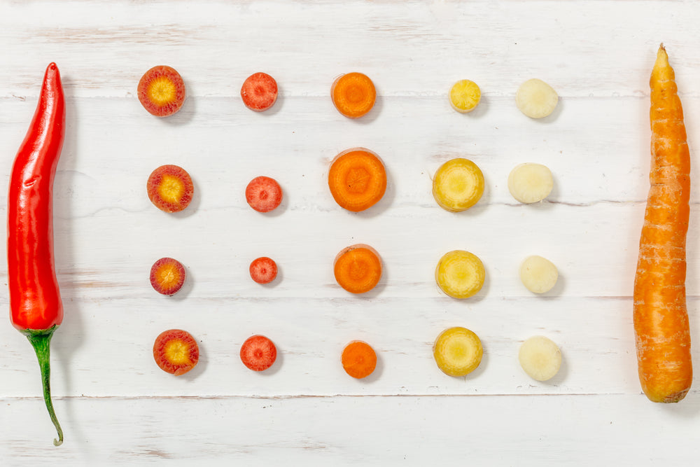
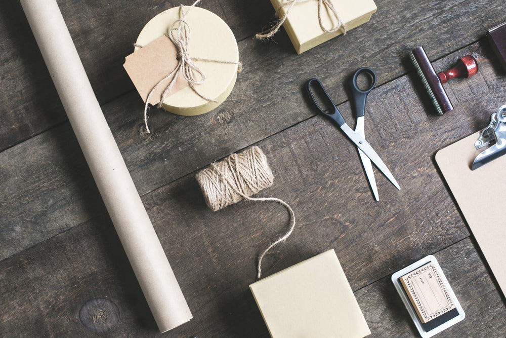
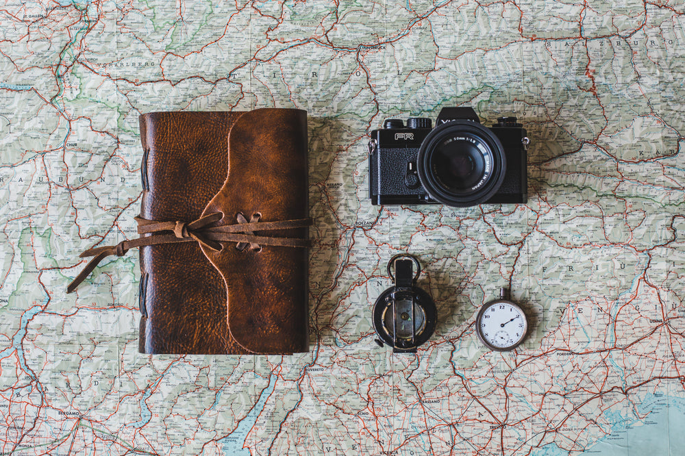
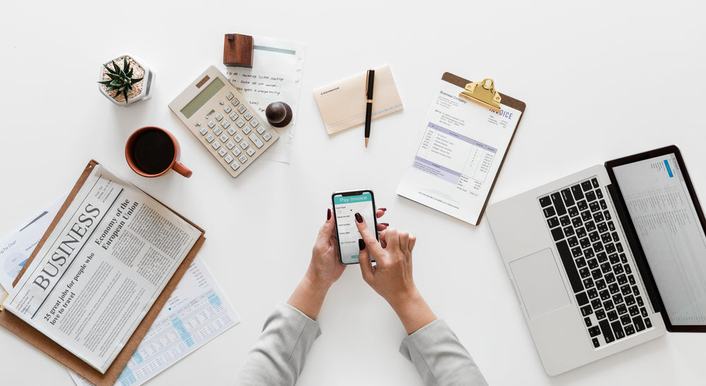
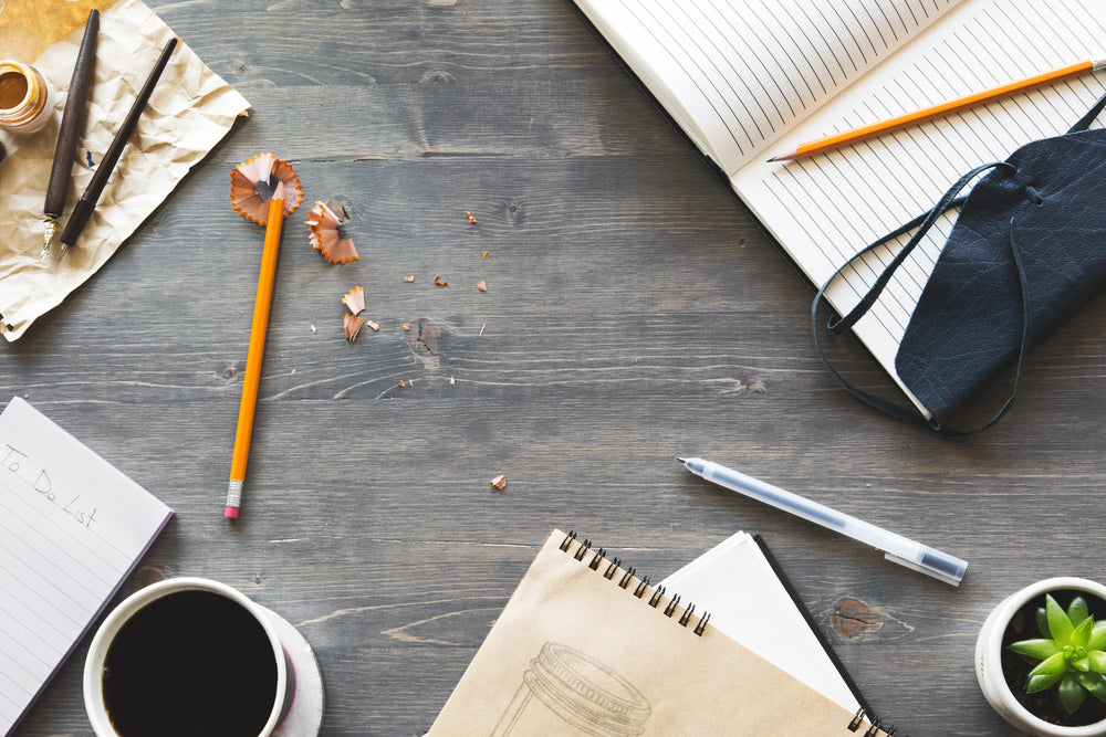
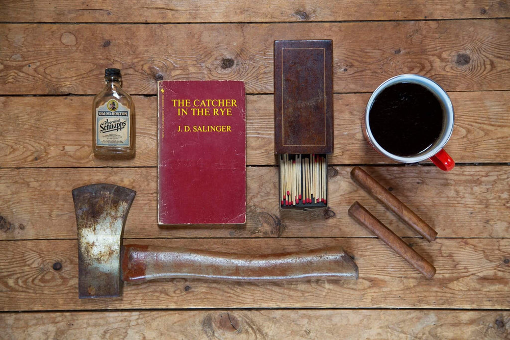
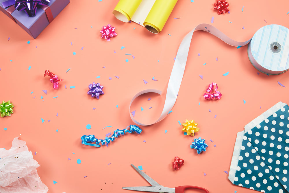
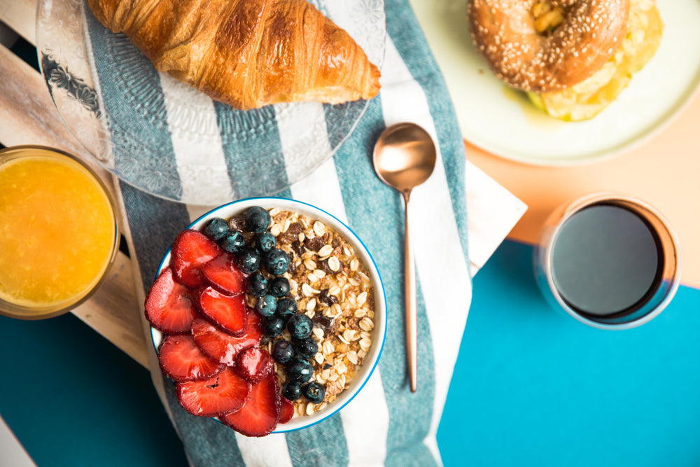
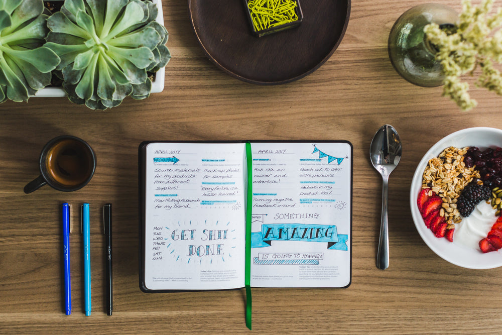
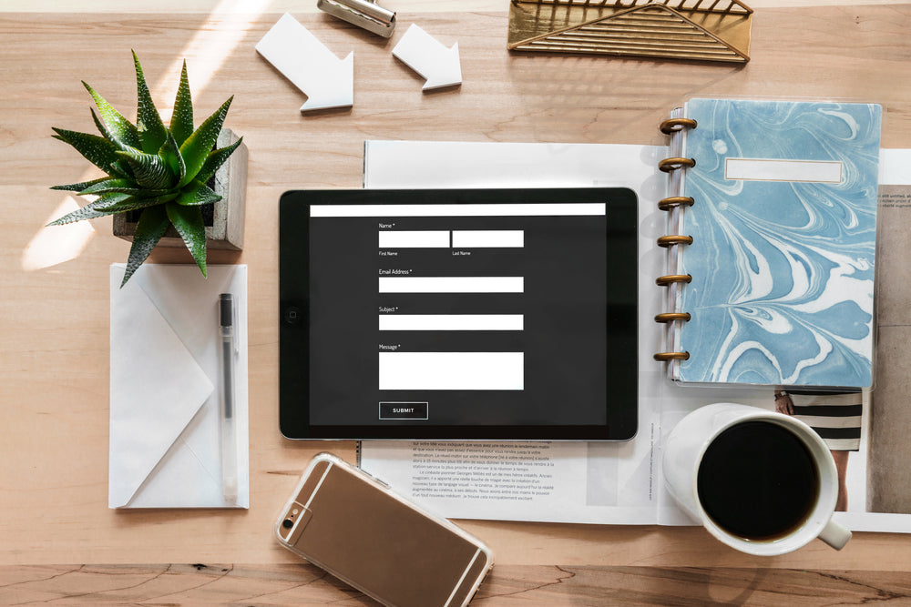
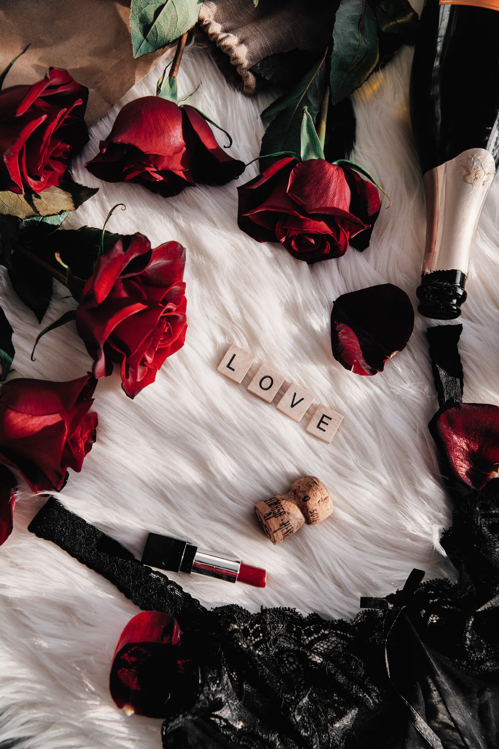
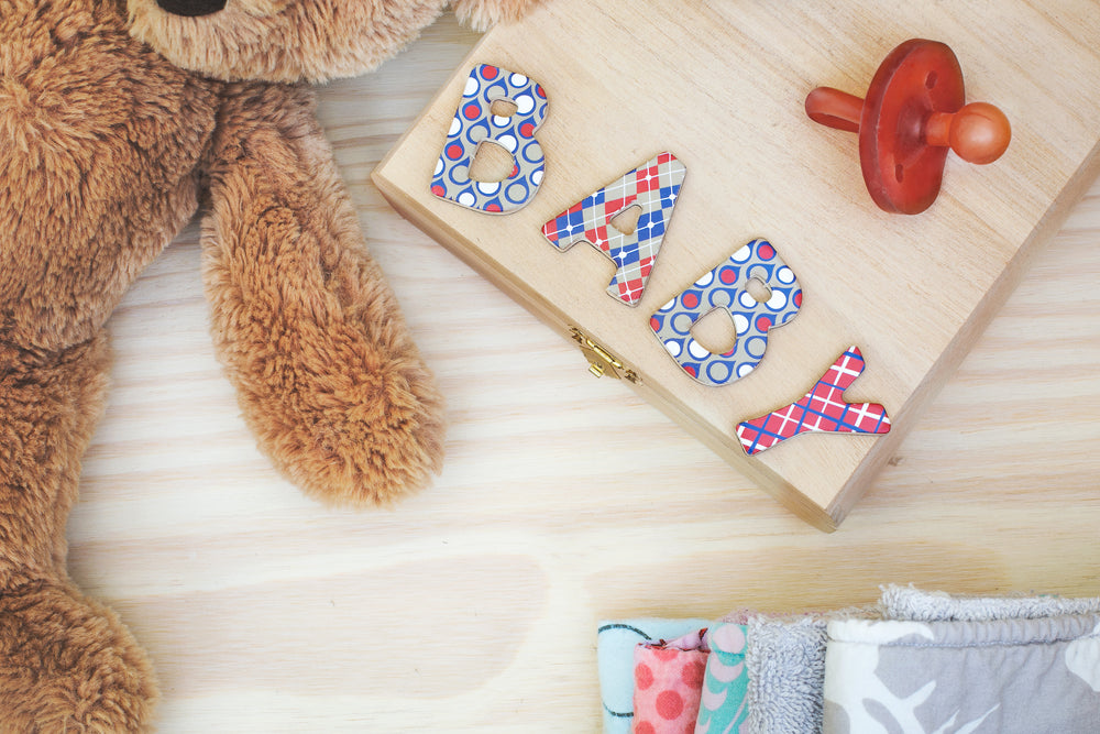
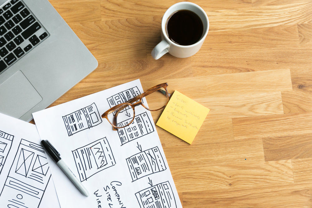
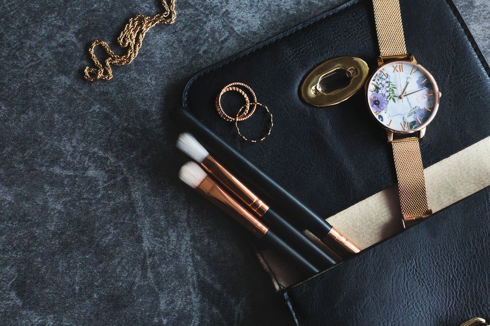
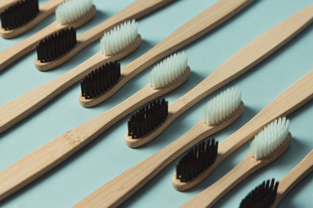
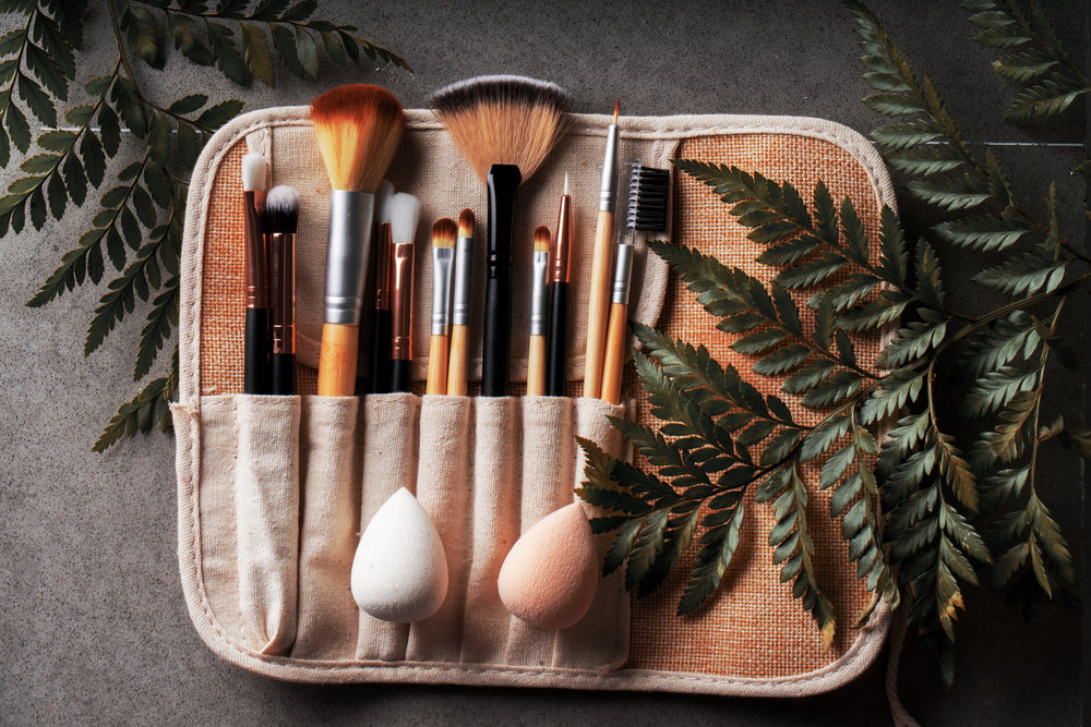
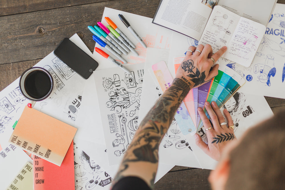
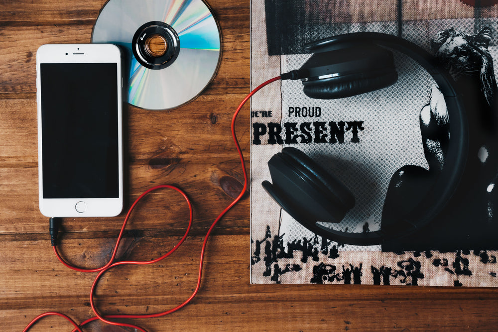
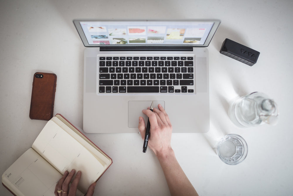
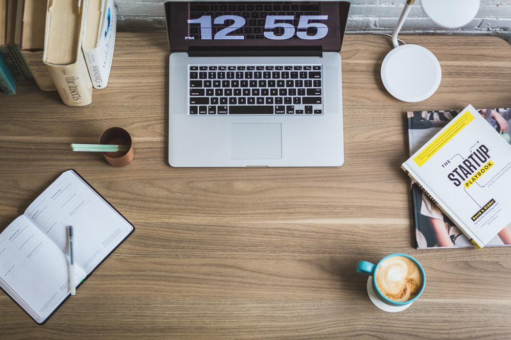
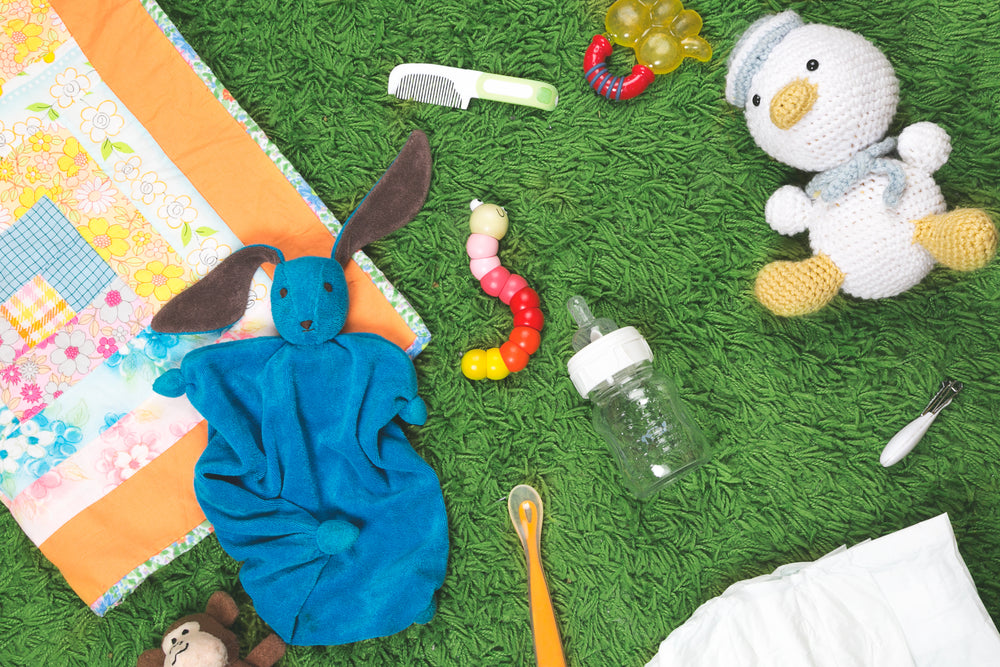
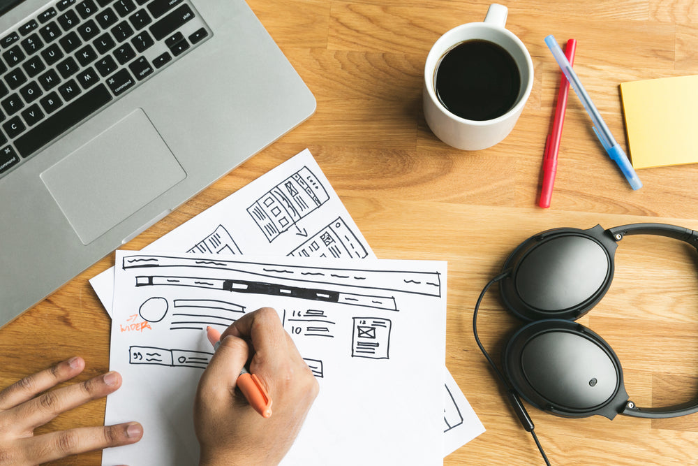
Flatlay photography is an easy and creative way to showcase groups of products, give a stunning snapshot of a work space, or just showcase thematic elements in an aesthetically rich way.
Are you looking to launch your online business?Try Shopify for free!
Start a business
Most everything you need to get started — photos, suppliers, and more
Flatlay Stock Photos for Businesses, Articles and More - HD and Royalty-free
Tips for Your own flatlay photography
是什么让这种类型的摄影这么受欢迎not just the look of the photography style, but that it’s relatively easy to do. Generally you don’t need to be a professional photographer to take a great flatlay image - an iPhone camera and good lighting will do!
Feel free to browse our database of flatlay images or check our tips below for creating your own beautiful pictures.
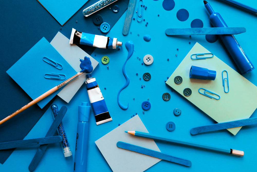
Shoot for a single color palette
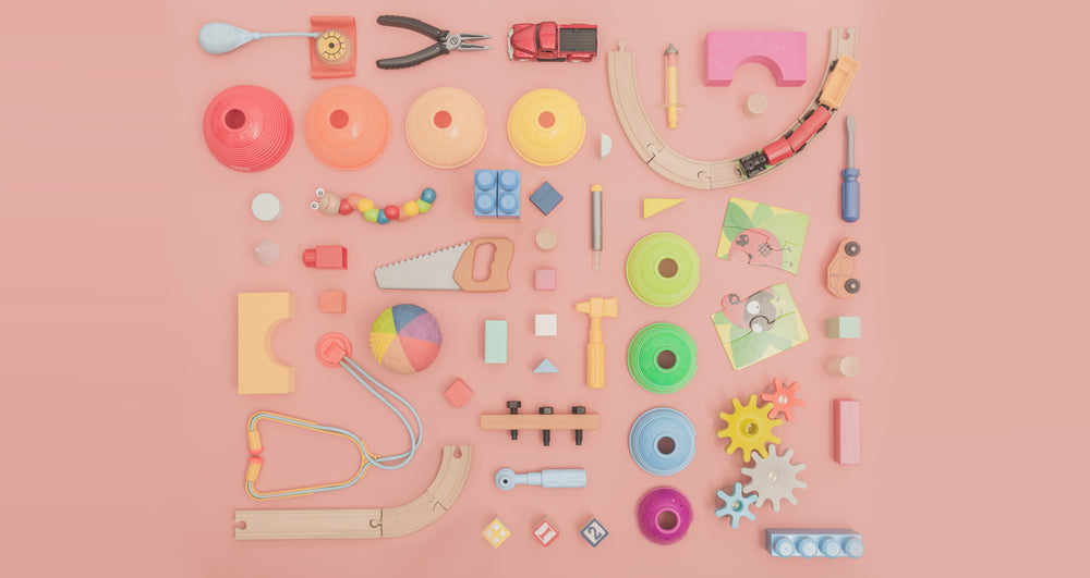
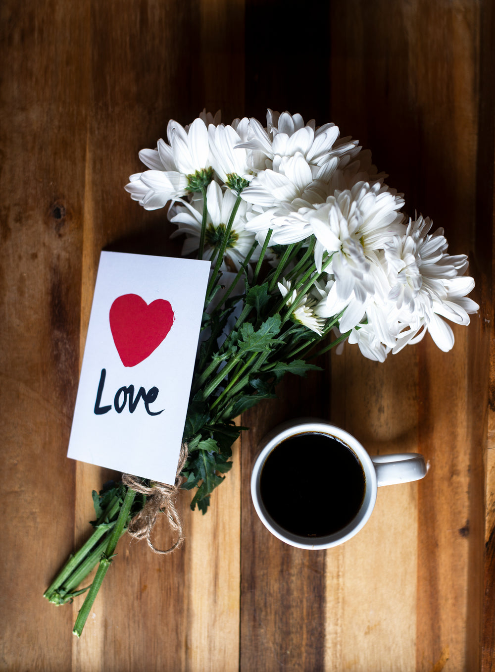
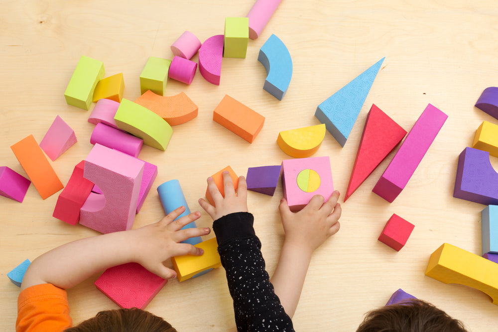
Generally speaking - it’s best to select a colour pallette of about 2-3 unifying colours and work around those colors with varying patterns and textures. Having a predetermined pallette will help to unify the composition of the image and direct the mood of the piece. For example - object in navy blue and deep red will usually give the image a more somber feel to it whereas bright pinks and purples will make the image a bit more playful.
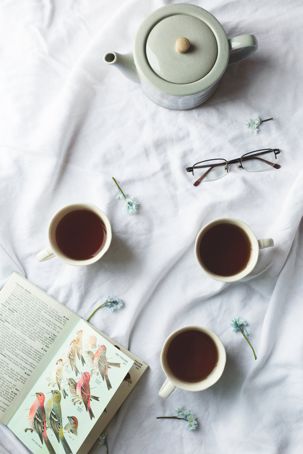
You’ll also want to make sure you use a neutral background colour as well. Most flatlay pictures use a white background, but feel free to experiment with black, grey or more muted wood tones as well. A neutral background colour will make the foreground items stand-out, complimenting the items and focusing your audience's attention towards your subjects.
Let the composition of your pictures tell a story
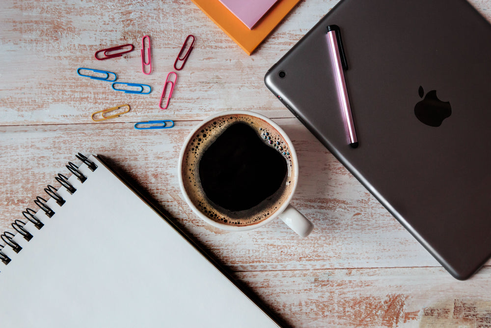
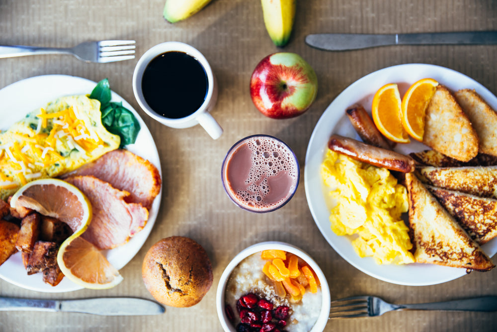
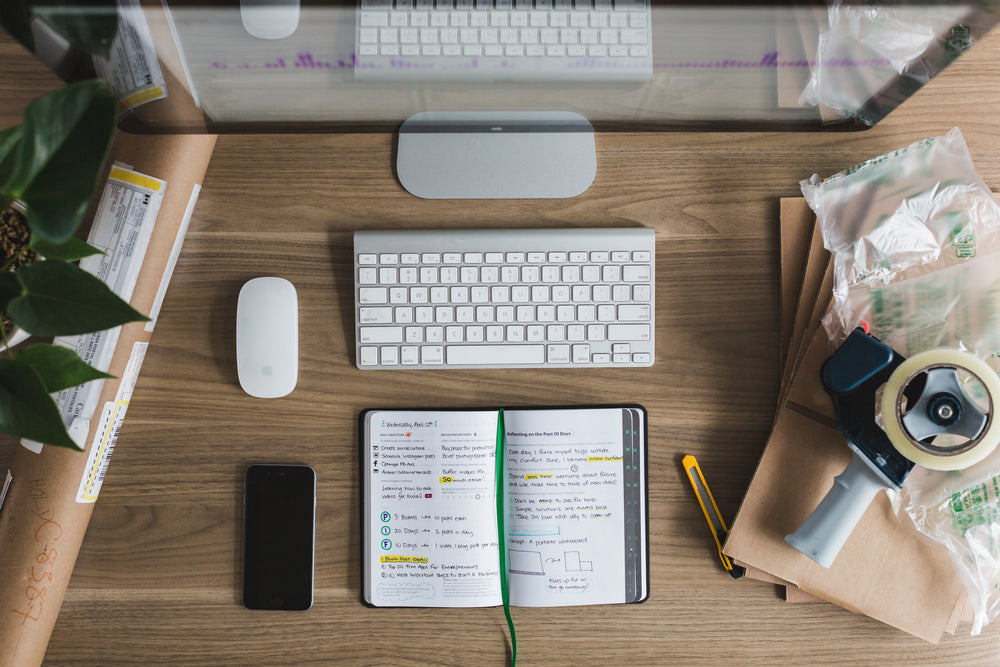
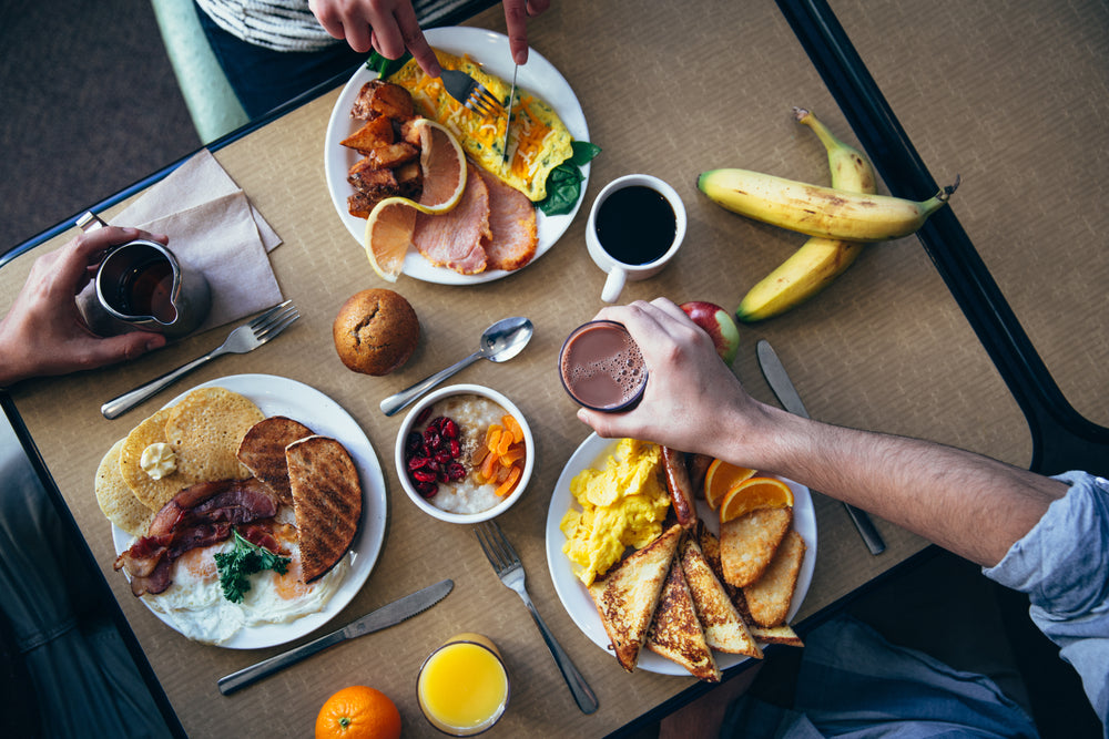
It’s important to consider the concept of narrative in composing flat-lay photographs. You may want to think of a “theme” before you begin and then select objects that work around this theme. For example - if your theme is “Cluttered Office” - you might choose to use objects like pens, notebooks and coffee cups. If your theme is “Brunch Time” - you might include items like toasted bagels and sparkling mimosas. Let your image tell a story through objects surrounding a common theme.
Experiment with Space and Lighting
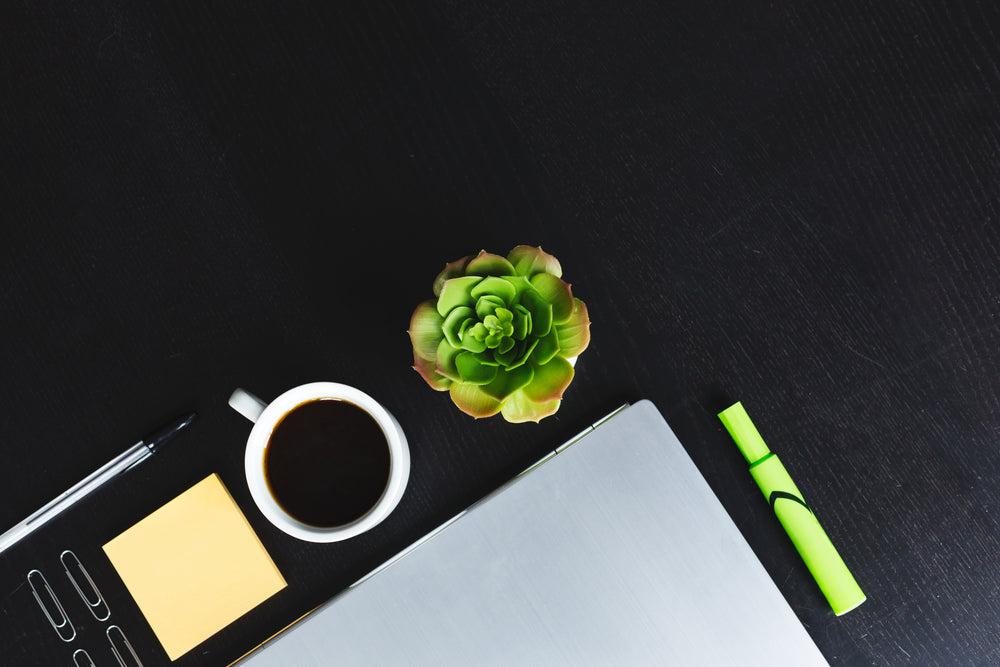
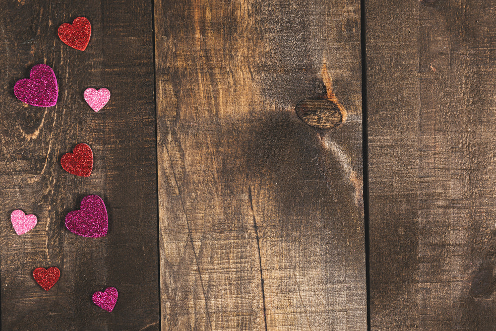
Not all flatlay images are built the same. For some - a cluttered workspace might convey a sense of chaos to the audience while a more sparse use of objects with more negative space might give the viewer a sense of calming isolation.
With regards to lighting - it’s generally best to use calm, overhead lighting. You don’t want your lights to be too bright however, as this can wash-out some of the beauty of your colours and create jarring, odd shadows.
Natural light works best as well - especially in the morning when the sun has risen but is not yet in full force. If you’re looking for a more neutral, balanced lighting design, try going out on a day that’s a little bit cloudy to get a soft-light effect.
Your photo is downloading now…
Get first access to free photos and other Burst content. Unsubscribe anytime.
Get first access to free photos and other Burst content. Unsubscribe anytime.
