What happens when you get a pair of Wall Street investment bankers who love their custom shirts, hate the everyday in-store shopping experience and want to start their own menswear line?
Well, the short answer isJ.Hilburn, the wildly popular and successful retailer that has managed to bridge the online and offline experience for its customers and who shows no signs of slowing down.
Founded in 2007 by Hill Davis and Veeral Rathod, the company today has a network of over 3,000 personal stylists in over 40 states that personally meet with individual customers to take their measurements and allow them to place orders for shirts, trousers, and jackets online made with the finest Italian fabrics and available at affordable prices.
Men can also choose from a wide range of accessories that include everything from pocket squares to cashmere sweaters and more.
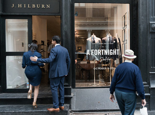
Looking to experiment with the idea ofcreating a retail experiencein the heart of SoHo, New York, J. Hilburn sought to bring its brand offline through apop-up shop.
Starting Off On the Right Foot
To help them get the experience just right, the company found the pop-up space usingStorefront, had the brand experience created byMelissa Gonzalez, and theinterior designdone byHomepolish只与工作Krrbfor vintage decor and furniture pieces.
Continuing on our theme of providing DIY retail design tips ranging from putting together your firstwindow display,merchandising your store, organizing yourstore layout, and more, this post will look at how designers from Homepolish tackled the task ahead of them and worked with J.Hilburn to create a unique and unforgettable experience for customers.
Interior Design Democratized
But before getting into how Homepolish tackled the design challenge of bringing J. Hilburn's brand to life in its pop-up space in SoHO, New York, a few words about the company making waves in the interior design space.
With a mission to make interior design services available and affordable for almost any budget, the company has a network of designers across the U.S. that start with an initial consultation for $50 and work on a per-hour basis on projects that start at just $500. With over 1,000 residential redesigns and commercial office projects for companies like BarkBox, Gilt, and Sailthru, it had just what J. Hilburn was looking for when it decided to open its doors to New York for a limited two-week window.
According to Homepolish, J. Hilburn wanted to give existing and potential clients a brick and mortar space to see, feel and try on their clothes that reflected their sophisticated and masculine aesthetic; giving customers an opportunity to experience the brand’s lifestyle.
The Grand Entrance

The pop-up shop needed to demonstrate the lifestyle of J. Hilburn’s customer: the elegant, sophisticated man that appreciates a good suit. Choosing a storefront on Grand Street in SoHo, the Homepolish team anticipated a lot of foot traffic from new unassuming customers that would need to understand the brand as soon as they walked in the door. Creating an unintimidating and beautiful in-store experience was key.
Visualizing the Custom Clothing Experience

Another key area of focus was that meeting and greeting customers in person was an invaluable experience to the J.Hilburn team. Another key objective was bringing the product to a small accessible space so as to allow the customer to visualize themselves in the well-made shirts, pants and jackets that J. Hilburn builds with lasting quality in mind.
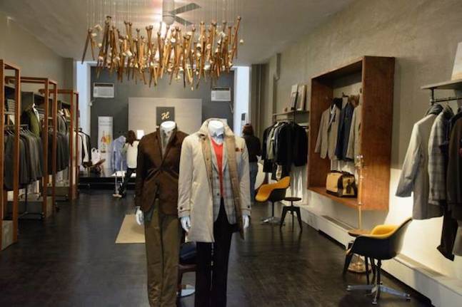
The Homepolish design team built wood and metal displays that worked with and around the clothing, ensuring an enhanced look and feel to the area in which the product was showcased.
EnhancingProducts with Smart Design

Needing to obviously showcase the clothing front and center, Homepolish worked with founders Hil and Veeral to enhance their product with smart design.
Floating above a standing parade of very well dressed mannequins, a hanging display of vintage thread spools was the visual focal point of the space. Relevant, refined art and well-decorated shelving made the space feel lived in while contributing to a graphic understanding of the brand.
虽然技术上弹出,j . Hilburn不是interested in creating a space that felt temporary or transient so Homepolish delivered a beautiful, tasteful store that felt like it had been and would be in SoHo for years.
The End Result
Once everything was in place,"J.Hilburn: A Fortnight in SoHo"was open to the public from October 7th to 20th, 7 days a week from the hours of 11 AM to 8 PM, allowing anyone to make an appointment with a personal stylist to get measured and browse the company's take on premium quality menswear made-to-fit.
As Jon Patrick, VP of Design at J.Hilburn put it in an interview with Esquire magazine, "We wanted to give people an in-store experience and to provide them with that in a cool, unintimidating space — to have a dialogue with new and existing customers to show them what we’re about, and how we can help them."
For a more inside look into the pop-up shop, here's an interview courtesy of StyleTV's Colin McDonald:
(Image Credits:Champion Hamilton)

