When online shoppers decide to buy something, they want to complete the purchase as quickly as possible. While buyers understand they need to provide merchants with essential info that ensures they receive a product, theydon’twant to be bogged down by excessively long checkout pages.
In response, a growing number of merchants are transitioning to one-page checkouts, which streamlines the checkout experience and optimizes it for speed and conversion. Recently, Shopify has rolled out the new one-page checkout to Basic, Shopify, Advanced, and Plus merchants on September 25, 2023. Our one-page checkout is already helping merchants such asStella EatsandHemlock & Oakenhance their customers' shopping experience and boost their sales.
To help you unlock the potential of a one-page checkout, here’s everything you need to know about implementing one for your business.
Table of contents:
- What is a one-page checkout?
- Features of a one-page checkout
- Benefits of one-page checkout
- 4 ways to optimize a one-page checkout
What is a one-page checkout?
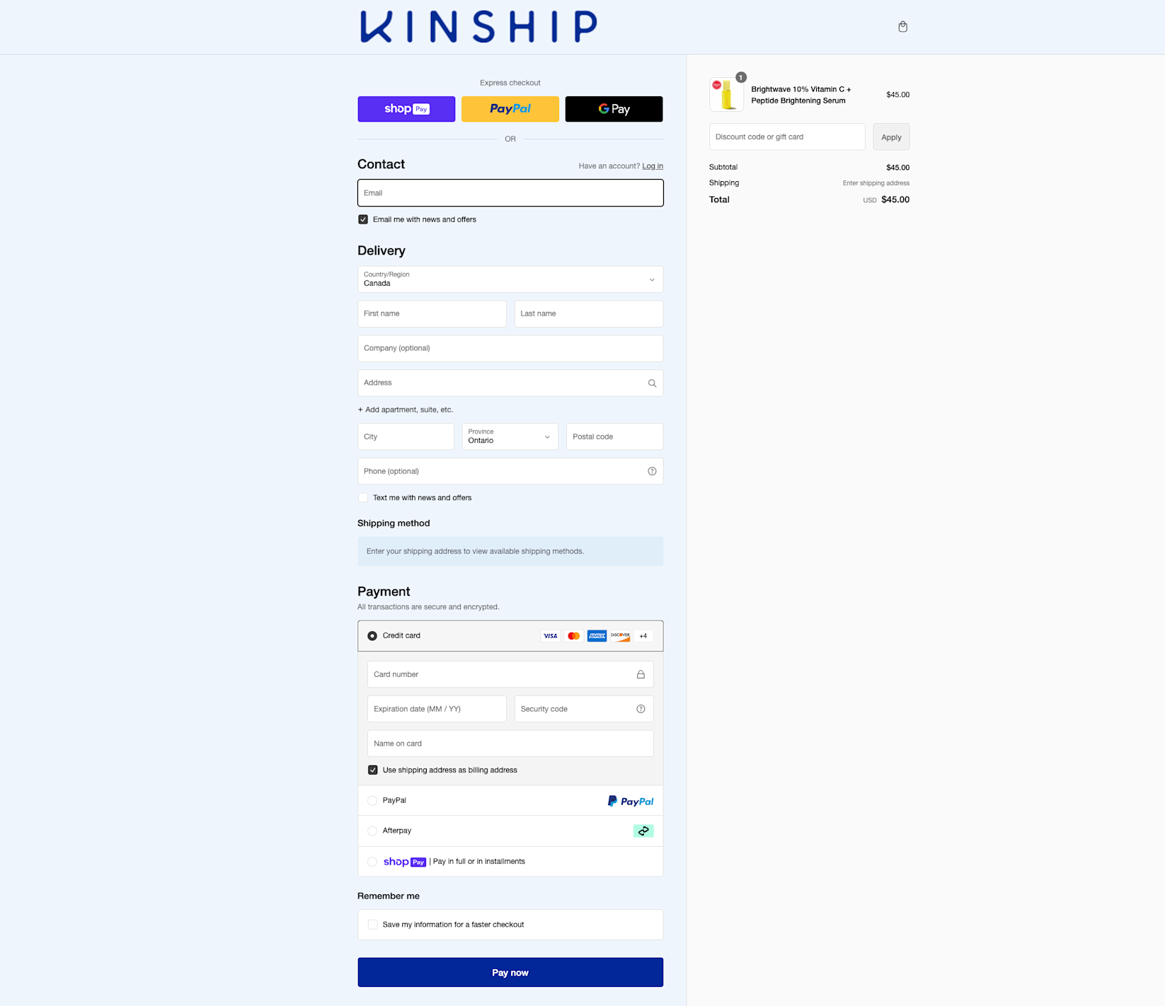
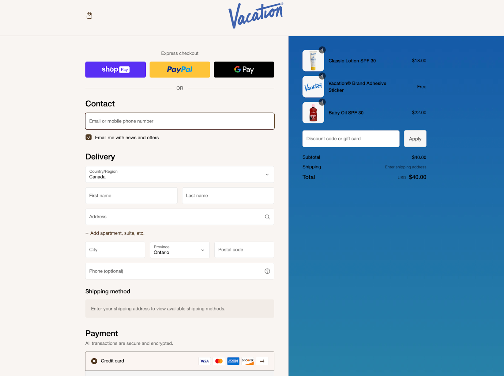
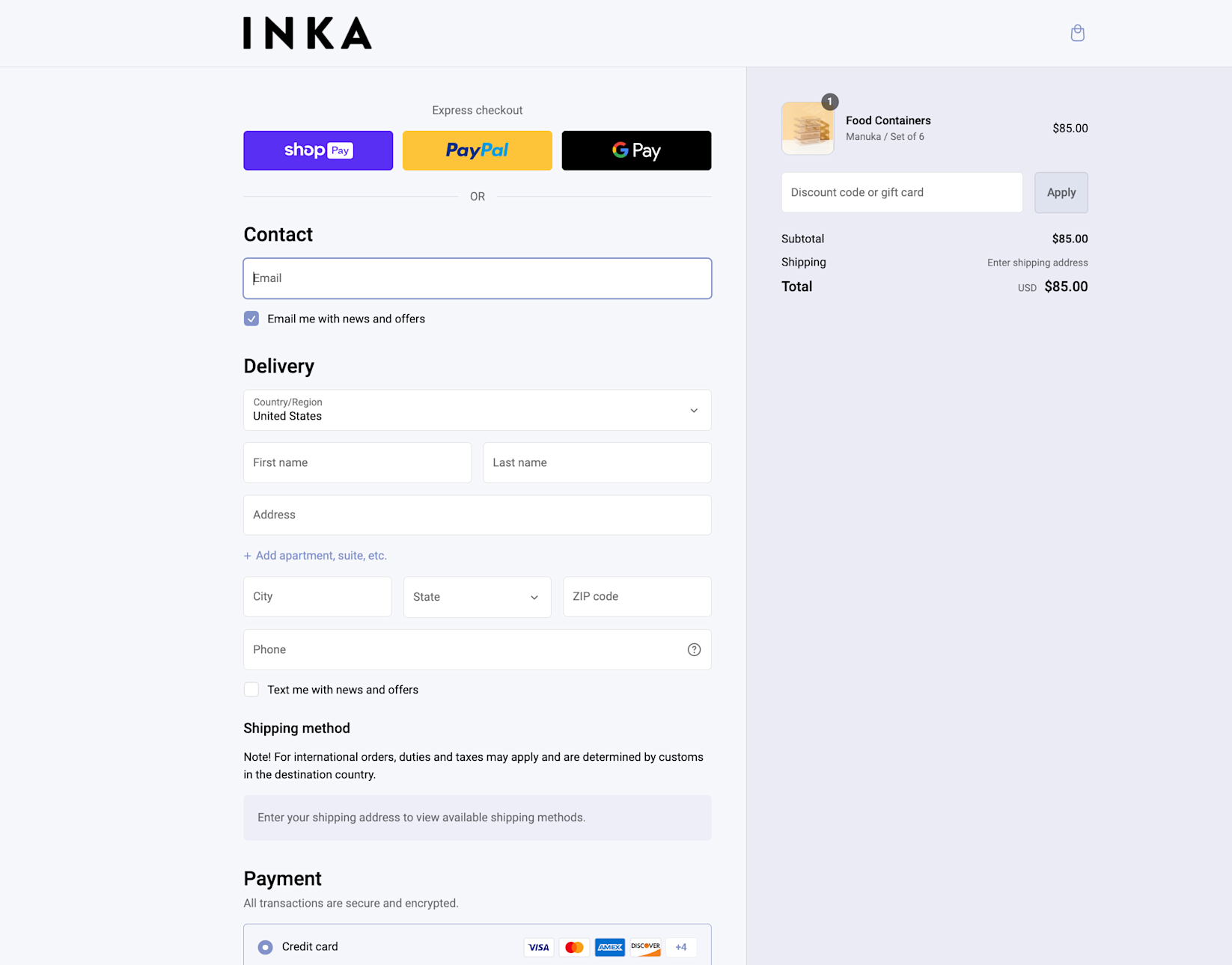
A one-page checkout is an ecommerce checkout process that condenses all of the elements of a standard checkout process onto a single page, including cart contents, payment details, shipping and billing address, and shipping options.
With a one-page checkout, the user can input all relevant information, review their order, and complete their purchase on a single page, eliminating the need for multiple page loads and reducing the time and effort required to make a purchase.
Features of a one-page checkout
Simplicity and speed are the defining features of one-page checkout. By centralizing every critical aspect of the transaction process onto a single page, shoppers can input their data, review order details, and complete transactions without navigating to different pages. A one-page checkout:
- Displays product selections, pricing, and shipping options.Buyers can review their purchase—including product details—total cost, shipping timeframes, delivery fees, and company policies, all in one place.
- Presents all required form fields.All the necessary customer data—including contact information, shipping address, shipping method, and payment details—are requested at once.
- Is fully customizable and designed to be extensible.Shopify’s one-page checkoutis built on Checkout Extensibility and gives merchants a unique level of flexibility. Our one-page checkout seamlessly integrates with your existing extensibility apps and is upgrade safe. Plus merchants can easily preview and switch between the three-page and one-page layout within the checkout editor.

One-page checkout example
Benefits of one-page checkout
Customers want a fast and easy checkout process; businesses want to boost conversions and make it easier for customers to buy their products. One-page checkouts offer a win-win for both parties.
For customers
One-page checkout takes a lot of the headache out of the buyer journey for customers. By reducing the number of checkout steps and clicks required from the customer, one-page checkouts streamline the entire checkout process. This also eliminates wait times between page loads and confusion about where to go next.
Overall, one-page checkouts offer an improved user experience and higher customer satisfaction, and they remove friction from the buyer’s journey.
For businesses
One-page checkouts such as Shopify Checkout are designed to drive higher conversions and reduce friction between the buyer and merchant. Not only does a one-page checkout expedite the buying process, but it also enables merchants to deliver a best-in-class experience that delights your customers and motivates them to come back.
Merchants also get increased flexibility to tailor the visual aspects of a one-page checkout to align with their brands. You can add custom fonts, favicons, and colors, while alsoextending capabilitiessuch as delivery date pickers or customized shipping options through third-party applications.
4 ways to optimize a one-page checkout
- Leverage customizations
- Add new functionality through apps
- Reduce and simplify form fills
- Update order summary and pricing during checkout
While one-page checkouts offer many advantages without much tinkering, the true extent of their potential comes from tailored optimizations targeted to your customer segment. Here are five ways to optimize one-page checkout to maximize your results:
1. Leverage customizations
Many one-page checkouts, includingShopify checkout, allow you to create custom checkout experiences through no-code and custom-code applications. This means that crucial elements of your checkout can be tailored to your desired buyer experience without affecting the process’s core functionality.
For example, you can customize the checkout page design with colors, fonts, logos, and favicons that align with your main website’s brand experience, fostering consistency in the user's journey.

2. Add new functionality through apps
Use checkout apps and application programming interfaces (APIs)—sets of rules and protocols that allow different software applications to interact with each other—to tailor your one-page checkouts to your needs. This enables you to provide specific checkout functionality relevant to your customers, products, and shipping requirements.
For example, you can use apps to collect additional information about buyer preference at checkout to suggest products or subscriptions, add loyalty program options, provide pickup options, and offer fields for gift messages.
One-page checkouts and extended apps (third-party solutions that add extra capabilities to the checkout) also allow you to add functionality like customized discounts, discount combinations, shipping rules—for example, populating shipping rates based on customer location—and custom payment methods. This can be accomplished by replacing or extending key parts of the checkout’s back-end logic with custom code.

3. Reduce and simplify form fills
The “simpler is better” rules that apply to multi-page checkouts also apply to one-page experiences—only ask for the information necessary to complete the transaction and ship the product.
That means limiting the number of form fills and making lower-priority information optional (if you include it). This ensures that the one-page checkout times remain fast and the buyers don’t experience useless friction.
4. Update order summary and pricing during checkout
Hidden costs are theleading cause of cart page abandonment.为了避免冲击在购物的时候,ensure that pricing is updated dynamically as users input information like promo codes, coupons, shipping addresses, and shipping methods.
One-page checkout FAQ
Can I customize the fields on my one-page checkout?
Yes, you can customize the form fields you want to show in one-page checkouts, tag fields as optional or required, and specify formats.
Are there any drawbacks to using a one-page checkout?
Some potential drawbacks of using a one-page checkout include a change of experience for your customers and unintended impacts on your current conversion rate and checkout metrics.
How can I measure the effectiveness of my one-page checkout?
You can measure the effectiveness of your one-page checkout by installing tracking pixels to monitor key performance indicators like conversion rate and cart abandonment rate over time.
Read More
- Guest Checkouts: Definition, Benefits, and Best Practices
- Website Builder 2023: Create a Website in Minutes
- 12 Checkout Process Optimization Tips to Increase Ecommerce Revenue
- 11 Ecommerce Checkout Best Practices: Improve the Checkout Experience and Increase Conversions
- What 1-Click Checkout Can Do for Your Small Business
- How to Optimize Your Mobile Checkout Flow
- 6 Best Open-Source Ecommerce Platforms for 2023
- 11 Ecommerce Checkout Best Practices: Improve the Checkout Experience and Increase Conversions
- Six Must-Have Technologies to Build the Best Ecommerce Tech Stack


